How to Create a Consistent Brand Look Across 1,000 Product Photos

You’ve got a great product. Maybe you’ve got 50 great products. Now you need photos, and not just any photos, but photos that look like they all belong to the same brand, shot on the same day, by the same team.
That’s the hard part.
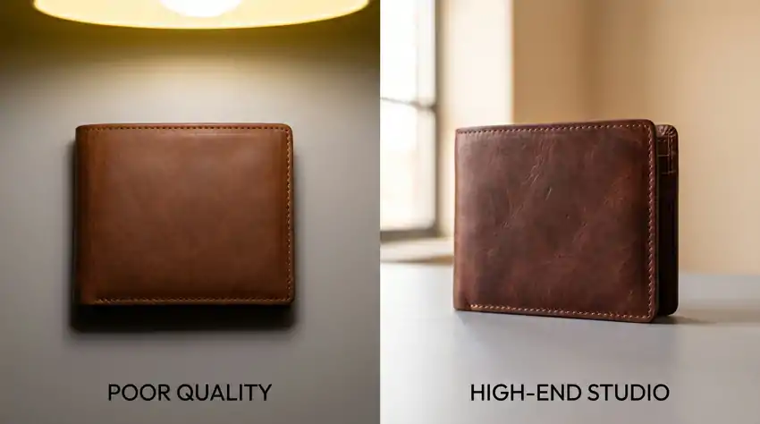
E-commerce brands often begin product photography haphazardly, leading to inconsistent images. After six months, they find mismatched lighting, shadows, and backgrounds, making their catalog look disjointed.
This guide is about fixing that, and preventing it from happening in the first place, whether you’re shooting 100 products or 1,000.
Why Consistency Actually Matters (It’s Not Just Aesthetics)
Before getting into the tactics, it’s worth understanding why this even matters.
When a customer visits your category page, mismatched product images create a feeling that something is off. They may not say, “these photos are inconsistent.” Instead, trust decreases. Browsing slows. Cart abandonment increases.
Salsify’s 2024 report reveals that customers prefer familiar, trusted brands. Consistent visuals boost this trust, with color consistency enhancing brand recognition by up to 80%.
So yes, this is worth getting right.
Step 1: Build Your Photography Style Guide Before You Shoot Anything

The single biggest mistake brands make is skipping the style guide and just “winging it,” planning to fix inconsistencies in post-production. That never works at scale.
Your style guide doesn’t need to be a 40-page PDF. A one-page document with reference photos and specific settings is enough. What matters is that it exists and everyone on the team uses it.
Here’s what your style guide should include:
Background specifications: Pure white (#FFFFFF), off-white, light grey, or lifestyle setting? Pick one for hero shots and stick with it. If you use multiple background types for different image slots, define which background goes in which slot across all products.
Angle and composition rules: Set a default angle, height, margin, and background. For instance, use a front-facing hero image at a 15-degree angle, covering 85% of the frame, and a secondary image at a 45-degree top-down angle.
Lighting setup: Specify the lighting setup clearly. Include the types of lights, like softbox, ring light, or natural light. Describe their positions around the product. Also, mention the target color temperature. Write it down so any photographer can easily replicate it.
Color temperature targets: Choose a white balance, typically between 5000K and 5500K for most products. Include it in your guide. All shots or corrections are based on this temperature.
Post-processing rules: Define your color grading approach. For instance, you might prefer warm tones with +15 temperature, desaturated blues, and high-contrast blacks. Also, list acceptable editing tools. Finally, mention edits you avoid, like heavy HDR, artificial bokeh, or oversaturation.
Step 2: Standardize Your Shooting Setup
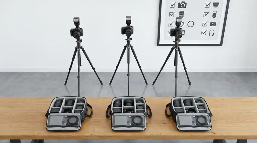
A good style guide is useless if the physical shooting setup changes between sessions. This is where most brands lose consistency without realizing it.
Using the same camera models, lenses, lighting kits, and backdrops for each shoot creates a consistent look. Color calibration tools make sure that what you see on-screen matches the final output. This reduces surprises during post-production.
A few practical things to lock down:
Use a color calibration card. Before every shoot, photograph an X-Rite ColorChecker or similar calibration card. This gives you a reference point when correcting white balance in post-production. Without it, you’re guessing.
Mark your studio floor. Mark tripod and lighting positions with tape on the floor for quick setup. This simple step allows you to shoot 200 products in a day with consistent results.
Shoot tethered. Connect your camera to a laptop and use tethering in Lightroom or Capture One. This allows you to view each shot in real time on a monitor and compare it to your reference image, catching any drift instantly.
Pick one lens and keep it. Use one focal length for your entire catalog to ensure consistent product appearance. Different lenses create varying distortions and perspectives.
Step 3: Create a Master Preset for Post-Processing
Shooting is only half the job. The edit is where brands either pull everything together or watch it fall apart.
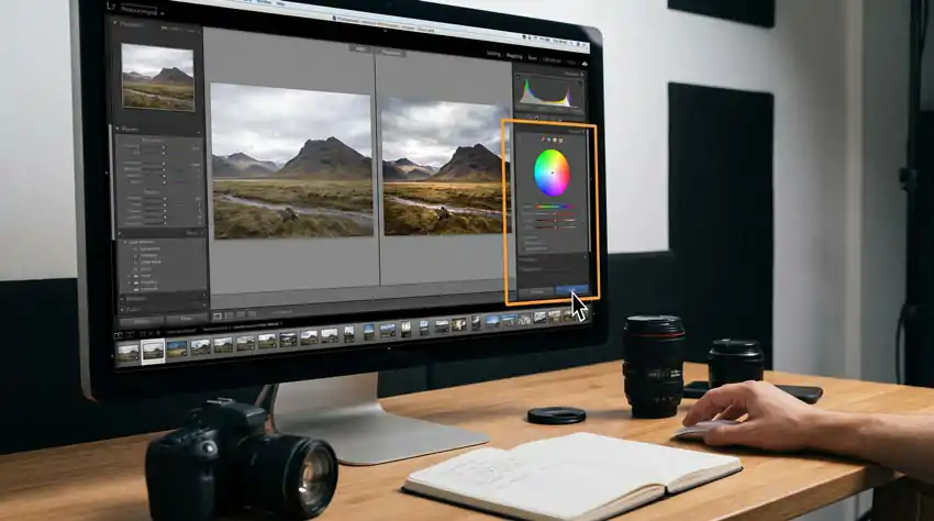
Consistency in product photography is tough, especially with many images. Lightroom presets help by applying uniform color, contrast, and tone adjustments to all images at once, making your catalog look cohesive.
Here’s how to build and use a master preset properly:
Start with one perfect image. Pick your best product shot from a recent session. One with good exposure, accurate color, and the look you want. Edit it manually until it looks exactly right. Every adjustment you make becomes the foundation for your preset.
Save it as your master preset. In Lightroom, click the “+” button in the Presets panel, name it something obvious like “Brand Master v1,” and save all your global adjustments.
Apply and sync across a batch. Edit one photo to your liking, switch to Grid view, copy the edit settings, select all the photos you want to edit, and paste the settings. Then make small individual adjustments where needed.
Always edit against a reference image. Without a fixed standard, every image gets re-decided individually, which guarantees drift over a large catalog. Keep your reference image open in a second window while you work.
One thing to watch: don’t over-saturate. Saturated colors look vibrant on individual images but make a full catalog look garish. Aim for colors that are accurate first, attractive second.
Step 4: Build a QA Checklist for Every Batch
At 1,000 photos, you can’t eyeball every image in isolation. You need a systematic quality check, and it has to happen before images go live.
The best way to spot issues is by using grid view in Lightroom. Open your catalog in grid or contact sheet mode and scan across rows. This makes inconsistencies in white balance, exposure, or shadows more noticeable than viewing images individually.
Your QA checklist should cover:
- White balance looks the same across all images in the batch
- Product takes up the same approximate percentage of the frame
- Shadows are consistent (same direction, same softness)
- Background is the same shade of white or grey, not blown out on some and creamy on others
- No color casts from reflective surfaces that weren’t caught in post
- Image sharpness is consistent, no soft edges from focus drift
Best editing workflow: import, cull, fix white balance, adjust exposure, apply preset, retouch distractions, crop, export in sRGB, and optimize for web. Follow this sequence to avoid worsening problems.
Step 5: Use a Digital Asset Management System
When you work at catalog scale, file organization is a big issue. It’s hard to find the right image version. You need to know which files the team has approved. Tracking what the team has retouched becomes difficult without a system.
A digital asset management (DAM) system keeps product photography guidelines accessible for internal teams, freelancers, and agencies. Options include Bynder, Brandfolder, or a well-organized Google Drive.
What matters is the folder structure and naming convention, not the tool itself. A simple naming convention that works: [ProductSKU]_[ImageType]_[Version].jpg
So SHT-BLU-001_hero_v2.jpg tells you exactly what product it is, what shot type it is, and which version you’re working with. No more folders called “final,” “final2,” and “final_ACTUAL_USE_THIS.”
Set resolution and format guidelines for consistency across platforms, like product pages and social media. Standard naming and folder structures speed up batch processing and updates when you need to make changes.
Step 6: Plan for New Products Before They Arrive
Brands struggle a year after scaling when new product photos clash with existing ones. This mismatch occurs if the photographer doesn’t have a style guide or if lighting changes after a studio move.
Prevent this by treating your photography style guide as a living onboarding document. Every new photographer, agency, or contractor should receive it before they touch a product. Brief them on it. Show them comparison examples of what consistent looks like versus what inconsistent looks like.
Templates for composition, lighting, editing, and file formats help new photographers match your brand’s style. This saves time and reduces training as your team expands.
Test new photographers with a small shoot of five products using your style guide. Review their work against your catalog to catch any issues before scaling up.
What About AI Tools?
AI editing tools have become highly effective for large-scale projects. For example, FrameOnce allows you to set a style from one image and apply it to many, addressing variations that traditional Lightroom can’t manage. A 200-image edit that takes 10 hours manually can now be reviewed in just 30 minutes.
AI can’t fix issues like inconsistent lighting or backgrounds in source images. While it speeds up production, the key benefit is a reliable system that maintains quality and brand consistency as you grow.
Use AI to speed up the edit. Use your style guide and standardized setup to make the source material worth editing in the first place.
The Bottom Line
Making 1,000 product photos look consistent isn’t just about having a top camera or fancy editing software. It’s about deciding on standards first, recording those choices, and applying them the same way each time.
Build a style guide. Lock in your physical setup. Create a master preset. QA in grid view. Use a naming system that makes sense. Brief every photographer before they shoot.
Do those six things and your catalog will look like it came from a brand that knows what it’s doing, because it will.
Start your photography style guide this week. Even a one-page Google Doc with three reference photos can save you hours of re-shoots and edits later.