How Many Product Images Does a Listing Really Need? (Research-Backed Answer)

Most sellers just guess. They throw up three or four photos, hit publish, and then scratch their heads wondering why a competitor selling almost the same thing is crushing them on conversions.
Here is the thing- there is actual data on this. And the answer might be more than you are currently using.
The Short Answer: 7 to 9 Images, Each Doing Its Own Job
If you want a number to work with right now, shoot for 7 to 9 images per listing. Amazon allows up to 9 slots, and research consistently shows listings with 7 or more images convert 25 to 40% better than those with fewer.
Going from 4 images to 7 or more on Amazon alone has been tied to a 32% lift in conversion rate. That breaks down to about 18% from lifestyle shots, 8% from infographic images, and 6% from close-up detail shots.
But there is a catch. Seven repetitive studio angles of the same product do nothing. You need 7 images that each answer a different question the buyer is sitting there asking.
What the Research Actually Says
Baymard Institute tracked what shoppers actually do when they land on a product page. Turns out, 56% of them go straight to the images first, before the title, before the reviews, before anything else. Images are not supporting content on a product page. They are the main event.
Their research also showed more than half of ecommerce shoppers have either returned a product or abandoned a cart specifically because the images were not good enough. That is the same problem showing up twice, once as a lost sale, once as a return.
Salsify’s 2024 research found that 76% of shoppers say image quality is the deciding factor in whether they even bother exploring a product further. And 45% of them have returned something because the product did not match what the photos showed.
MDG Advertising put it plainly: 67% of consumers say image quality matters more to them than product descriptions (54%) or customer reviews (53%).
And in a survey by Digital Commerce 360, 35% of 1,000 shoppers said not having enough product images was one of their biggest frustrations with online shopping in the past six months.
Every source points the same direction. Images carry more weight than almost anything else on your product page, and most listings are not doing enough with them.
Why Most Sellers Stop at 3 or 4 Images
Amazon gives you 9 slots. The average seller uses 4 or 5.
Part of it is time. Shooting and editing more images takes effort, especially if you have a large catalog. But the cost of skipping those extra images shows up in your conversion rate, and it is not small.
Picture what it is like to shop online for something you have never bought before. You cannot pick it up. You cannot feel the weight of it. Also, you cannot hold it next to something in your hand to figure out if it is the right size. Everything that happens naturally in a store has to happen through your photos.
When you give a shopper 3 images, you are asking them to fill in a lot of blanks on their own. Some will. Many will not. They will click over to the next listing that shows them more.
Nfinite surveyed over 1,000 consumers and found that 83% would return a product if it did not match what the photos showed. And 72% said they would be less likely to buy from that retailer again. Fewer images does not just hurt one sale. It damages trust over time.
How to Think About Your Image Gallery
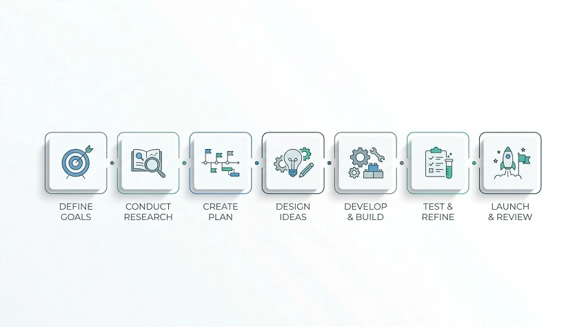
Your image gallery is not a photo album. Think of it as a sales conversation you are having without words.
Each image should answer a question the shopper is silently asking. Here is how the best-performing listings typically build their image sets:
Image 1: Clean studio shot
Plain white or neutral background. Product fills 85% or more of the frame. No props, no text overlays. This is your search result image, it determines whether someone clicks at all. Amazon requires pure white (RGB 255, 255, 255) for the main image.
Resolution matters here too. High-res images with zoom capability have been linked to up to 10% higher sales. Minimum 1,000px on the long side, but aim for 2,000px.
Images 2 and 3: Multiple angles
Front, back, side, whatever gives someone a full spatial picture of the product. Not everyone is shopping on a big monitor. These shots make sure no one is surprised by what shows up at their door.
Image 4: Lifestyle shot
This is where you show the product in real life. A wireless speaker on a beach towel. A candle on a bathroom shelf. A backpack leaning against a subway seat.
This image does emotional work. It helps the buyer picture owning it, which is a completely different kind of persuasion than showing what it looks like against a white wall.
Image 5: Detail close-up
Stitching on a bag. Grain on a wooden cutting board. Texture on a phone case. These shots reduce the fear of “this looked different online.” They build quality confidence before the product even ships.
Image 6: Infographic or dimensions
Show key specs visually. How big is it really? What is it made of? How does it compare to something familiar? People skim bullet points but they look at pictures. This is your chance to communicate specs in a format people actually absorb.
Image 7: Scale reference
Probably the most underused image type out there. Show someone holding it. Put it next to a water bottle or a standard household item. Size confusion is one of the top reasons for returns. This image costs almost nothing to shoot and saves a lot of headaches.
Images 8 and 9: Packaging or variants
If the unboxing experience matters (gifts, premium items), show the box. If your product comes in multiple colors or sizes, a comparison shot here prevents wrong-variant orders.
What the Numbers Look Like by Platform
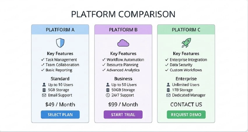
Amazon: 9 image slots plus a video slot. Use them all if your product has any complexity. Over 70% of Amazon browsing happens on mobile, where images dominate and text gets scrolled past.
Shopify and your own store: No fixed limit on most themes. Shopify’s internal data shows professional photos correlate with 33% higher conversions compared to poor-quality photos. For furniture, apparel, or anything where size and texture matter, 6 to 12 images is a solid range.
Etsy: Up to 10 photos per listing. Handmade products especially benefit from process shots and material close-ups. Etsy buyers want to understand how something was made. That is often part of why they are buying it.
Fashion and apparel: This is the category where image count matters most. You need front, back, and side shots on a model, flat lay photos, fabric close-ups, and a clear size or fit reference. Clothing listings with fewer than 5 images are at a real disadvantage.
When Adding More Images Actually Backfires
More is not always better. There is a point where extra images stop helping.
If you upload four nearly identical angles of the same product, shoppers notice. It signals that there is nothing new to see, which is the opposite of what you want. It can actually lower confidence rather than raise it.
One good lifestyle shot paired with one clean product image will outperform a gallery of 30 repetitive studio shots every single time.
For most product categories, the sweet spot sits between 7 and 12 images. Beyond that, you are mostly adding noise unless your product genuinely needs the coverage, think large furniture, complex electronics, or anything with multiple components.
The Return Rate Problem Nobody Talks About
Better images do not just get you more sales. They get you fewer returns.
When buyers can see a product from every relevant angle, understand its actual size, and get a real sense of the material quality, they are much less likely to receive it and feel misled.
Returns are expensive. Processing, restocking, sometimes disposal. For most ecommerce businesses, cutting the return rate by even a few percentage points changes the unit economics in a meaningful way.
The Nfinite survey found that 57% of shoppers are willing to pay more for a product if it means they can trust that what they see matches what they get. Better images let you charge more and ship back less.
So, What is the Right Number for You?
Here is the simple breakdown:
Most products: 7 to 9 images minimum.
Simple products (basic accessories, single-function items): 4 to 6 images can work, just make sure you have a clean studio shot, a lifestyle context image, and at least one detail or scale reference.
Complex products (apparel, furniture, electronics, multi-part kits): Go for 9 to 12. Use every slot available. Add video if you can.
The number is less important than the question behind it: does each image answer something the previous one did not? When you run out of new questions to answer, you have enough photos.
Most sellers stop long before that point. They answer maybe half the questions a serious buyer would ask. That is the gap between a 2.5% conversion rate and a 4.7% one.

Start with your three lowest-converting products. Look at their images honestly. Ask yourself if someone could look at those photos alone and feel genuinely confident in what they are buying. If the answer is no, you have found your starting point.
Fix those three first. Measure the results over 30 days. The numbers will tell you exactly how much this is worth.
Getting more sales does not always mean more traffic. Sometimes it just means showing people enough to actually say yes.