The Artistry & Impact of Typography Design

In a world inundated with visual content, typography stands as a silent yet powerful communicator. Typography, at its core, is the art and technique of arranging type to make written language not only legible but also visually engaging. It encompasses the choice of fonts, their arrangement, sizing, spacing, and color, all working harmoniously to convey a message or evoke an emotion. Typography is the unseen conductor of the symphony that is graphic design, guiding our eyes and thoughts as we navigate through a sea of words.
Importance of Typography Design

Typography design is the unsung hero of effective communication. It plays a pivotal role in shaping the way we perceive and interact with written information, from a simple road sign to an intricate website. Beyond aesthetics, typography influences readability, sets the tone, and reinforces brand identities. The importance of typography design extends into various fields, including advertising, branding, web design, and print media.
Understanding typography’s significance allows designers and communicators to wield its power intentionally, making it an indispensable tool in the visual language of the digital age. In this exploration of typography design, we will delve into its essential elements, applications, and emerging trends, shedding light on the artistry and functionality that define this intricate craft.
Historical Evolution of Typography

The roots of typography can be traced back to ancient civilizations where various writing systems emerged, including cuneiform in Mesopotamia and hieroglyphics in Egypt. However, it was in the illuminated manuscripts of the Middle Ages that typography began to exhibit its artistic potential.
Scribes painstakingly copied texts by hand, utilizing diverse scripts like Uncial, Carolingian, and Gothic. These manuscripts were works of art themselves, often adorned with intricate illustrations and decorative letterforms.
The turning point in typography’s history came with Johannes Gutenberg’s groundbreaking invention of the movable-type printing press in the mid-15th century. Gutenberg’s press made it possible to reproduce text quickly and accurately, ushering in the age of printed books. The Gutenberg Bible, printed around 1455, stands as one of the most famous early examples of this technology.
The Renaissance, a period of cultural rebirth and renewed interest in classical learning had a profound impact on typography. During this time, typography began to shift towards greater legibility and elegance. Roman typefaces, inspired by ancient Roman inscriptions, gained prominence. The development of these typefaces brought about a significant improvement in readability.
One of the key figures in this era was Aldus Manutius, a renowned printer and publisher. He introduced italics, which were slanted typefaces designed to emulate the handwriting of the time. Additionally, Aldus Manutius played a pivotal role in standardizing punctuation, introducing the semicolon, and advocating for the use of the comma in printed texts.
The Modern Age of Typography

The modern age of typography, spanning from the 17th century onward, has been marked by continuous evolution and innovation in typography design and technology:
Transitional and Didone Typefaces: During the 18th century, type designers like John Baskerville introduced transitional typefaces characterized by a more refined and contrasted design. Later in the 19th century, Didone typefaces emerged, known for their high contrast between thick and thin strokes, exemplified by fonts like Bodoni.

Industrialization and Mass Printing: The Industrial Revolution in the 19th century led to significant advancements in printing technology. Steam-powered presses and innovations in paper production made it possible to produce printed materials at an unprecedented scale.

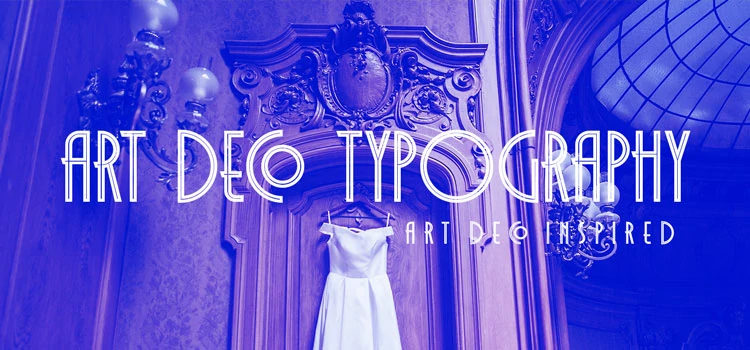
Art Nouveau and Art Deco Typography: The Art Nouveau movement introduced organic and ornamental typefaces, often used in decorative and poster design. This gave way to the Art Deco movement of the 1920s and 1930s, characterized by geometric and streamlined typefaces.
Digital Typography: The late 20th century saw the advent of digital typography with the development of computers and digital font technologies. This revolutionized the design and production of typefaces, allowing for greater flexibility and customization.

Postmodernism and Eclecticism: In the latter half of the 20th century, modern designers pushed the boundaries of typography, experimenting with eclectic and playful approaches. This period saw the rise of deconstructionist typography.

Contemporary Trends: In the 21st century, typography design continues to evolve with the integration of technology. Responsive web design has led to a focus on typography that adapts to various screen sizes and devices.

Globalization and Multilingual Typography: As the world becomes more interconnected, typography design has had to accommodate various languages and scripts. Designers are increasingly tasked with creating typefaces that are accessible and legible across different cultures and writing systems.

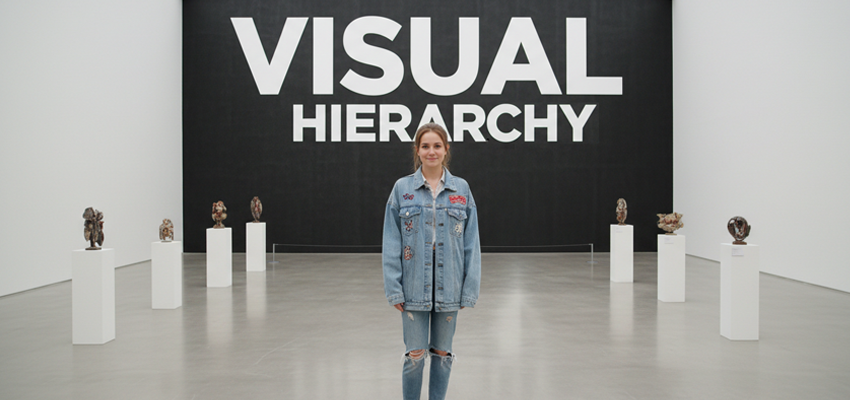
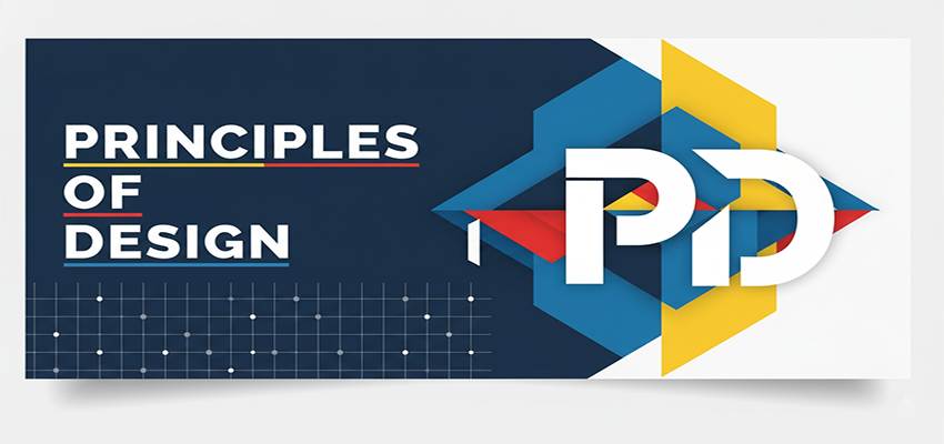
Key Elements of Typography Design
Typography is a multifaceted discipline, and mastering its key elements is essential for creating effective and visually appealing designs.
1. Typeface Selection

Typeface selection is a fundamental aspect of typography design. It involves choosing the appropriate typeface or font family for a particular project. Each typeface conveys a distinct mood and personality, so selecting one that aligns with the intended message and audience is crucial.
Serif typefaces can evoke tradition and formality, while sans-serif typefaces often convey modernity and simplicity. Script fonts can add a touch of elegance, while decorative and display fonts offer creative flair.
2. Typeface Pairing

Typeface pairing is the art of combining two or more fonts in a harmonious way to create visual contrast and hierarchy. Pairing fonts effectively can enhance readability and add visual interest to a design. Designers often select a primary font for headings and a complementary font for body text. The pairing should strike a balance between contrast and coherence, ensuring that the overall design remains cohesive.
3. Font Size and Line Spacing

Font size and line spacing (leading) play a critical role in determining the readability and aesthetics of typography. Choosing an appropriate font size ensures that text is legible at various viewing distances and across different media. Line spacing, or leading, affects the spacing between lines of text.
It can impact readability and the overall visual appeal of a layout. Properly adjusting font size and line spacing is essential to create a balanced and accessible typographic design.
4. Typography Color
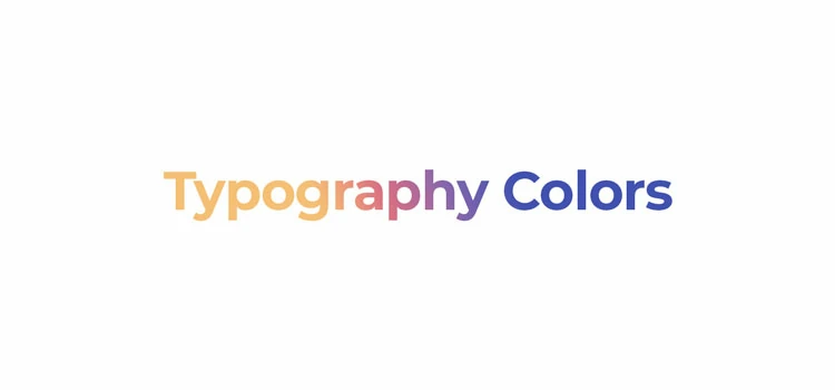
Typography color refers to the use of color in text to convey meaning, hierarchy, and style. Color can enhance the visual impact of typography, especially in branding and marketing materials. It’s important to consider the contrast between text color and background color to ensure readability.
Additionally, designers can use color to highlight important information, create visual emphasis, or evoke emotions, making it a versatile tool in design.
Typography in Branding and Marketing

Typography plays a pivotal role in shaping brand identity and marketing strategies. It serves as a visual anchor that communicates a brand’s personality, values, and message to the audience. In this section, we explore the significance of typography in branding and marketing.
Role of Typography in Brand Identity

Typography is a cornerstone of brand identity. The choice of fonts in a brand’s logo, marketing materials, and website sets the tone for how the brand is perceived. Each typeface carries its own connotations, whether it’s the timeless elegance of a serif font, the modern and approachable nature of a sans-serif font, or the playful spirit of a script font.
Consistency is key in branding, and typography is no exception. Establishing a consistent set of fonts and typographic guidelines ensures that a brand’s message remains clear and recognizable across various touchpoints, fostering brand loyalty and trust.
Typography in Advertising

Effective typographic choices can make advertisements stand out and engage the target audience. Here’s how typography is utilized in advertising:
Headlines and Catchphrases: Bold, eye-catching headlines often employ larger fonts and distinctive typefaces to grab the viewer’s attention. Clever use of typography can convey the essence of the message instantly.
Readability and Legibility: In advertising, text must be easily readable, especially in outdoor and digital formats. Typeface selection, font size, and spacing are carefully considered to ensure that the message is clear and digestible.
Brand Consistency: Typography in advertising materials should align with the brand’s established typographic identity. This consistency reinforces brand recognition and trust.
Emotional Impact: Typography can convey emotions and sentiments. Serif fonts may evoke tradition and reliability, while playful script fonts can create a sense of fun and excitement. The choice of typography can influence how viewers connect with the advertisement on an emotional level.
Call to Action (CTA): The typography used in a call to action, such as “Buy Now” or “Learn More,” can influence the viewer’s response. Well-designed CTAs that stand out and are easy to read are more likely to drive action.
Typography in Photography

Typography in photography is the art of combining text and images to create compelling visual narratives or convey information effectively. It can enhance the impact of photographs in several ways:
Captioning and Contextual Information: Typography is often used to provide context, captions, or additional information alongside photographs. In photojournalism, captions help viewers understand the story behind an image, offering essential details such as the location, date, and names of individuals involved.
Advertising and Promotions: Photographs used in marketing campaigns, posters, brochures, and social media often incorporate text elements. Captivating headlines, product descriptions, and calls to action are seamlessly integrated with photographs to engage the audience and convey marketing messages.
Branding and Watermarking: For professional photographers and visual artists, adding a watermark in photography or signature to their work is a common practice. This not only helps in establishing a personal brand but also serves as a copyright protection measure.
Photo Collages and Composites: Designers can use typography to create photo collages or composites, combining multiple images into a single visual piece. Typography can label or describe individual components of the collage, provide context, or tell a story through a series of images.
Fine Art Photography: Fine art photographers sometimes incorporate text into their work as a means of artistic expression. Whether through handwritten notes, poetry, or typographic design, text can add layers of meaning and depth to photographic art.
Exhibition and Gallery Displays: In gallery exhibitions or art installations, typography may be used to introduce the artist’s concept, provide context, or guide viewers through the exhibit. The typography used in such contexts is often part of the overall artistic presentation.
Typography in Web Design
Typography plays a vital role in web design, where digital content is presented to a global and diverse audience. In this section, we explore the key aspects of typography in web design.
Responsive Typography

Fluid Typography: Implementing font sizes and line spacing that are proportional to screen width helps maintain readability across devices. CSS units like “em” and “rem” are commonly used for this purpose.
Media Queries: Web designers employ CSS media queries to adjust typography settings based on screen size, orientation, and resolution. This enables the text to scale gracefully and maintain legibility.
Typography Breakpoints: Identifying breakpoints at which font sizes and line spacing should change ensures that the design remains aesthetically pleasing and user-friendly on all devices.
Web Fonts

Web Font Services: Many web font services, such as Google Fonts and Adobe Fonts, offer a vast library of typefaces optimized for web use. Designers can easily integrate these fonts into their projects.
Performance: While web fonts enhance design aesthetics, they can also impact page load times. Optimizing web font delivery through techniques like asynchronous loading and font subsetting is essential for a smooth user experience.
Font Pairing: As in print design, choosing complementary fonts is critical in web design. Designers often pair a distinctive display font for headings with a more readable font for body text.
Readability and Accessibility
Contrast: Sufficient contrast between text and background colors is essential for readability. Web Content Accessibility Guidelines (WCAG) provide specific contrast ratios that must be met for text to be considered accessible.
Font Size and Line Spacing: Fonts should be legible at various sizes, and line spacing should provide enough breathing room between lines of text. Responsive design techniques can help maintain optimal typography settings.
Semantic Markup: Using proper HTML semantic elements for headings, paragraphs, lists, and links ensures that screen readers and assistive technologies can interpret and convey the content accurately.
Font Choice: Selecting fonts that are easy to read, even at small sizes, benefits all users. Sans-serif fonts are often preferred for body text due to their clarity on screens.
Future Trends in Typography Design

As technology continues to evolve and design trends shift, the field of typography design is also advancing in exciting and innovative directions. In this section, we explore some of the future trends in typography design:
Variable Fonts and Parametric Typography
Variable Fonts: Variable fonts are a groundbreaking development that allows a single font file to contain multiple variations of a typeface, such as different weights, widths, and slant angles. Designers can now have greater flexibility and control over typography within a single font file.
Parametric Typography: Parametric typography takes customization to the next level by enabling designers to adjust type attributes dynamically. Designers can manipulate factors like x-height, stroke contrast, and letter spacing on the fly, tailoring type to specific design needs.
Augmented Reality Typography
AR Typography in Visual Art: Augmented reality (AR) technology allows typography to blend seamlessly with the physical world. Artists and designers can create immersive experiences by overlaying digital text in real-time onto physical objects or environments.
AR in Navigation and Information: Augmented reality typography can enhance navigation and provide context-aware information. For example, AR apps can display street names, directions, or translations in real-time when users point their devices at objects or signs in different languages.
AI-Generated Typography

AI-Enhanced Font Design: Artificial intelligence is being used to assist in the creation of fonts and typefaces. AI algorithms can analyze existing fonts and generate new variations or suggest improvements, accelerating the font design process.
Customizable AI-Generated Fonts: AI-powered tools enable designers to customize and adapt fonts to their specific needs. These tools use machine learning to understand user preferences and create fonts that align with a designer’s vision.
AI Typography in Dynamic Content: AI is being integrated into dynamic content generation. This means that AI algorithms can automatically generate typography styles that match the content, context, and target audience.
Case Studies
Let’s explore some of the notable typography design projects and successful typography campaigns that have left a lasting impact on the world of design and communication.
Notable Typography Design Projects
The New York Times Magazine’s “T” Covers: The New York Times Magazine is renowned for its creative and thought-provoking use of typography on its covers. The iconic “T” covers, designed by typographer Henrik Kubel, feature innovative and visually striking type treatments.
Typography in Movie Posters – “Birdman” (2014): The typography in the movie poster for “Birdman” is a standout example of how lettering can become an integral part of a film’s identity. The distorted and fragmented lettering reflects the film’s themes of fame, ego, and artistic identity.
Coca-Cola’s “Share a Coke” Campaign: Coca-Cola’s “Share a Coke” campaign is a marketing phenomenon that leverages personalized typography. The campaign replaced the Coca-Cola logo on bottles with individual names.
Obama “Hope” Poster: Shepard Fairey’s iconic “Hope” poster for Barack Obama’s 2008 presidential campaign is a powerful example of how typography can become a symbol of hope and change. The bold, stylized typeface and vibrant color palette contributed to the poster’s iconic status.
Analysis of Successful Typography Campaigns
Airbnb’s Rebranding: Airbnb’s rebranding in 2014 introduced a custom typeface called “Cereal” designed by Dalton Maag. The typeface, with its soft and rounded letterforms, aimed to convey a sense of belonging and approachability, aligning with Airbnb’s brand values of community and inclusivity.
NASA’s “Visions of the Future” Posters: NASA’s series of “Visions of the Future” posters combines stunning space imagery with vintage-inspired typography. The choice of typography pays homage to mid-century travel posters while introducing a futuristic twist.
Nike’s “Just Do It” Slogan: Nike’s iconic “Just Do It” slogan, paired with its distinctive logotype, has become one of the most recognizable and enduring campaigns in advertising history. The bold and assertive typography aligns perfectly with Nike’s brand message of empowerment and determination.
The Guardian’s Redesign: The Guardian newspaper’s 2018 redesign featured a significant typography overhaul, adopting a bespoke typeface called “Guardian Headline.” This change aimed to improve readability and create a consistent typographic identity across print and digital platforms.
To Conclude
Typography design is a subtle yet profoundly influential discipline that shapes how we perceive and interact with written information in various media. It’s not just about selecting fonts. Rather it’s about telling stories, conveying meaning, and creating memorable experiences through the artful arrangement of type. Its impact extends across diverse fields, from print and web design to advertising, photography, branding, and fine art.
Lastly, typography is more than just letters on a page; it’s the silent storyteller that bridges cultures, conveys emotions, and propels us into the future of visual communication.