What Is a Product Image Style Guide and Why Every eCommerce Brand Needs One
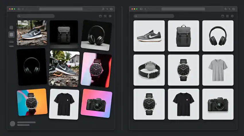
Most eCommerce brands obsess over ads, email flows, and conversion rate optimization. They spend thousands of dollars driving traffic. Then they lose the sale because their product photos look like they came from four different companies.
We have seen this more times than we can count. A store with great products, decent pricing, solid reviews, but the photography is all over the place. One product has a clean white background.
Another was shot on someone’s couch. A third one is dark and moody for no apparent reason. Shoppers do not consciously identify what is wrong, but they feel it. And that feeling kills trust faster than a bad review.
The fix is not always hiring a better photographer. Most of the time, the problem is that nobody wrote down what “good” looks like for that brand. There are no rules. Every shoot is a creative guess.
That is what a product image style guide solves.
So What Exactly Is a Product Image Style Guide?
It is a document. A real, written, shareable document that defines how your product photos should look, every single time, regardless of who is behind the camera.
It covers things like what kind of background to use, how to light the product, what angles to shoot from, how much space to leave around the product in the frame, whether lifestyle shots are allowed and what they should look like, and how images should be edited before going live.
Some people hear “style guide” and think of something generic, like a brand kit with logo colors and font choices. A product image style guide is more specific than that. It is focused entirely on photography and post-production. It exists so that a photographer you hired last week can produce images that match the ones your in-house team shot two years ago.
Without it, every person who photographs your products is making their own creative decisions. Sometimes they align with your brand. Often they do not.
Why This Actually Matters for Sales
Here is the thing most brands miss. Product photography is not just a visual preference. It is a conversion driver.
Splashlight did a study a few years back and found that 67 percent of online shoppers say image quality is a significant factor in their purchase decision. That ranked higher than product descriptions, customer reviews, and even price for a meaningful percentage of buyers. Your photos are doing more selling than your copy is.
When your images are consistent and professional, a few things happen at once.
Trust goes up immediately. A store where every product looks like it belongs on the same page signals to a shopper that somebody is paying attention. That subconscious feeling of credibility is worth more than any trust badge you can slap on a page.
Returns go down. When customers can clearly see what they are buying, in accurate color, from multiple angles, with a consistent sense of scale, they know what is coming. Surprises after delivery are what drive returns. Good photography eliminates most of those surprises before the order is even placed.
Your ads get cheaper. If you are running paid social, you already know that creative quality drives down your cost per click. Consistent, polished imagery performs better in ad auctions. Inconsistent imagery looks scattered in a carousel format and signals low quality to algorithms and humans alike.
Your team stops wasting time. This one does not get talked about enough. When everyone working on photography already knows what the output should look like, there is no approval back-and-forth, no reshoots because “this does not look right,” no extended editing cycles trying to match one image to another. The guide does that work in advance.
What Goes Into a Product Image Style Guide
A good one is detailed enough that a new photographer could read it and know exactly what you expect. But it is not so rigid that it kills creative flexibility in lifestyle and campaign work. Here is what to cover.
Background and Setting Rules
This is where most of the visual chaos starts. Some brands default to pure white backgrounds, and that makes sense for a lot of categories. White is clean, it works for Google Shopping and Amazon requirements, and it puts all the focus on the product itself. But white is not always the right answer.
Whatever you choose, write it down with specifics. If it is a solid color, include the exact hex or RGB value. If you use lifestyle settings, describe what environments are acceptable and which are not. “Natural light, neutral home environments” means something different to every photographer unless you show examples alongside the description.
Also clarify whether lifestyle shots supplement clean product photos or replace them. Most brands do both. Make that explicit.
Lighting Direction
Lighting is the single biggest variable between a photo that looks professional and one that looks like a phone snapshot.
Define whether you shoot with natural light, studio softboxes, or a combination. Specify where your key light typically comes from. Decide whether shadows should be visible, softened, or removed entirely in post. Hard shadows can look great for certain product categories. For others, they are a distraction. Pick a lane and document it.
If you have product categories with different lighting needs, break those out separately. Jewelry, skincare, food, and apparel all have their own quirks. A single blanket rule will not cover everything.
Image Dimensions and Format Specs
This is the unsexy part that saves enormous amounts of time later.
Every context where your product images appear has different size requirements. Your main product page, the thumbnail grid on category pages, hero banners, email campaigns, Instagram, Facebook ads, Google Shopping, Pinterest. These are all different dimensions. Document them all.
Also document your aspect ratios for original shots, your export format (JPEG for most web use, PNG when you need a transparent background), your target file size range, your color profile (sRGB is standard for web), and your file naming convention. None of this is glamorous. All of it matters.
Product Framing and Angles
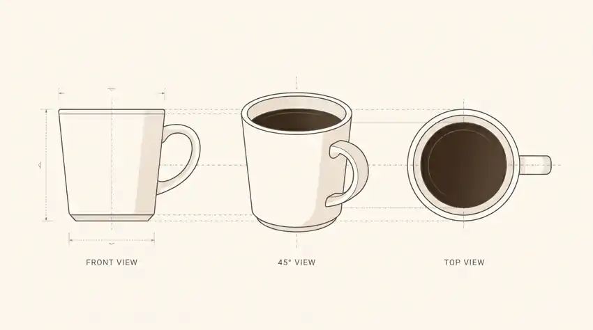
How much of the frame should the product occupy? Is it centered or can it be offset? Do you shoot flat lay, straight on, at a 45-degree angle, or from multiple perspectives?
Write this down and include reference images. Written descriptions of framing rules are okay. Showing them is significantly better. A one-page visual reference with annotated examples does more work than three paragraphs of text.
Also define how many images are required per product or product category. A pair of sneakers needs more angles than a candle. Set minimums so nothing ships to the site underrepresented.
Color Accuracy
For any category where color drives the buying decision, clothing, home goods, accessories, skincare, this section is critical.
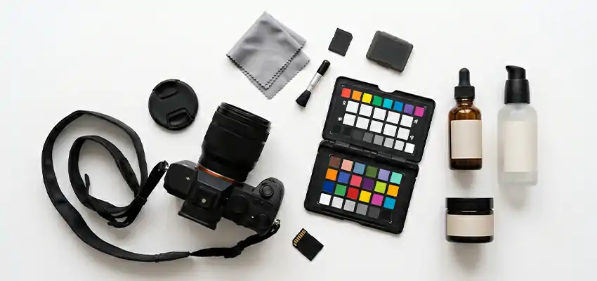
Explain how color should be captured and corrected. Are you using a color checker card to calibrate at the start of each shoot? What is your standard for comparing the final image against the physical product? How do you handle the fact that different screens display color differently?
Color mismatch between what a customer sees online and what shows up in the box is one of the top drivers of returns. Treat accuracy as a hard requirement, not a best effort.
Model and Lifestyle Direction
If people appear in your product photos, this needs its own section.
Who are your models, in terms of diversity, age range, and brand fit? How should they be styled for each product category, and who approves styling before a shoot begins? What expressions and energy are appropriate? What props are and are not allowed in lifestyle setups?
Without guidelines here, lifestyle photography becomes wildly inconsistent depending on the creative instincts of whoever is on set. Some photographers will go editorial. Others will go commercial. Neither is wrong, but they are different, and you need them to be consistent.
Editing and Retouching Standards
Every image gets touched in post. The question is whether your editing decisions are consistent.
Document what corrections are standard for every image (removing dust, minor exposure adjustments, background cleanup) versus what requires case-by-case approval. For lifestyle images, clarify your position on skin retouching, which is especially important if your brand has taken any public stance on authenticity or body representation.
How to Build One Without Overthinking It

Start with what you already have. Pull thirty or forty product images from your current store and lay them out on a single page. What patterns do you see? What images do you consistently like? And, what feels off?
That gut reaction is your first draft. Write down what the good images have in common. That becomes your starting point.
Then do a test shoot on one product before you finalize anything on paper. Follow your rough rules. See if a photographer can execute them. See if the resulting images actually match your vision. Adjust before you commit it to a document.
Once you have real reference photos, build the guide. Include written rules and visual examples on every page. Google Slides, Notion, Figma, a PDF, it genuinely does not matter what tool you use. What matters is that it is clear, it is shareable, and everyone who touches your photography has seen it.
Run one photographer or vendor through it before rolling it out across the whole team. Collect feedback. Refine. Then make it a living document you revisit when your brand evolves or when you expand into new product categories.
The Honest Answer on Timing
You do not need to be a big brand. If more than one person has ever photographed your products, you need this. If manufacturers or suppliers photograph products on your behalf, you definitely need this. Furthermore, if you are running ads and your creative looks messy, this is probably why.
The brands that build this early maintain a consistent visual identity as they grow. The ones that put it off spend years trying to reconcile a catalog full of mismatched images and wondering why their conversion rate is stuck.
Final Thought
A product image style guide is not a complicated thing to build. It is just a document that answers one question: what does a good product photo look like for this brand?
Answer that question clearly, write it down, add some visual examples, and share it with everyone who influences how your products are photographed. That is it.
The brands that do this well do not just look better. They convert better, return less, and spend less time fixing creative work that should have been right the first time.
Start with one product category. Get the rules right there. Then expand from it.
Subscribe for weekly practical content on growing an eCommerce brand without the fluff.