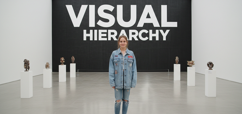
Visual Hierarchy Explained: Why Your Photos Look “Off”
If you have ever stared at a photo you know is sharp and well-exposed, yet it still feels weirdly “off”, you are probably dealing with visual hierarchy problems, not “bad photography.” The fix is often less about buying a new lens and more about guiding the viewer’s eye on purpose, the same way a designer controls attention on a poster, homepage, or product package. This is exactly why good photography post production can feel like magic: they do not just “make it pretty”, they repair the order your image is read.
Visual hierarchy
Visual hierarchy is the ranking system your viewer’s brain uses to decide:
- What to look at first,
- What to look at next,
- And finally, what to ignore.
In strong photos, that ranking feels effortless. In “off” photos, multiple elements fight for the #1 spot, or worse, the background wins.
As a design concept, hierarchy is built from a few predictable levers:
- Contrast (bright vs dark, sharp vs soft, saturated vs muted)
- Size (big shapes dominate)
- Position (what’s centered or placed with intent gets attention)
- Focus and detail (sharpness acts like a magnet)
- Direction and lines (leading lines, gaze, body angles)
- Spacing (negative space is not “empty”, it is control)
You do not need to use all of them. You just need them to agree.
Why photos feel “off”?
Your images are being judged in harsher conditions than they were 10 years ago:
- More viewing happens on mobile than desktop worldwide. Statcounter shows mobile slightly ahead in Nov 2025.
- Platforms are pushing vertical formats, which changes composition pressure and cropping risk. Instagram now supports 3:4 photos and has moved profile grids toward rectangles instead of squares.
- Even if you post 4:5, your grid preview may crop differently, so “safe zones” matter for hierarchy.
Your hierarchy must survive small screens, fast scrolling, and aggressive crops.
The #1 reason your photo looks “off”: competing focal points
A photo usually needs one boss (primary subject) and maybe one assistant (secondary). But lots of images accidentally create two or three bosses.
Common “boss fights”:
- A bright window in the background outshines your subject.
- A shiny highlight on a product becomes the brightest thing in frame.
- A saturated red object steals attention from a skin-tone portrait.
- A sharp background competes with a sharp subject.
Design rule: Your brightest highlight should usually be on (or near) the story. If the brightest pixel is in the corner, your viewer is attention exits the frame.
Your eye is biased, and that matters
Eye-tracking research consistently shows people often fixate toward the center of an image (a “central bias”), even before content fully drives attention.
That does not mean “always center your subject.” It means:
- If your subject is not near center, your hierarchy needs stronger guidance (contrast, leading lines, and framing).
- If something unwanted is near center (bright patch, signage, clutter), it becomes a problem fast.
Composition rules are not dead, but they are misunderstood
The rule of thirds and leading lines are useful, but not because they are “magic grids.” They work when they support hierarchy.
An eye-tracking study comparing viewers with photography education vs those without found that experts favored rule-of-thirds compositions more often, while novices were more likely to be pulled by other elements.
The takeaway: composition rules do not override hierarchy. If your background is yelling, thirds will not save you.
The 7 visual-hierarchy mistakes that make photos look “off”
1) The background has higher contrast than the subject
This is the classic “great portrait in a noisy parking lot” problem.
Fix while shooting:
- Move the subject away from the background.
- Use a wider aperture to reduce detail.
Fix during photo retouching:
- Reduce background clarity/texture.
- Lower background exposure slightly.
- Desaturate background “attention colors” (reds, yellows).
2) Your highlights are not assigned a job
Highlights should describe form or point to the subject, not randomly sparkle.
Fast test: Squint at your photo. Whatever still pops is winning.
Edit image to fix:
- Pull down highlights in competing areas.
- Dodge (brighten) the subject subtly, but keep it believable.
3) Everything is equally sharp
Sharpness is a hierarchy tool. If everything is sharp, nothing is important.
Fix the image by editing:
- Add subtle background blur (optical or simulated carefully).
- Apply selective sharpening to the subject only.
4) Color hierarchy is backwards
Color is emotional, but it is also a neon sign.
Common offenders:
- A bright teal/green object in the background
- Oversaturated skies that overpower faces
- Mixed lighting that creates weird color hotspots
Edit image and Fix the issue:
- Reduce saturation globally, then add it back to the subject selectively.
- Neutralize color casts that pull attention away from skin or product.
5) Your crop breaks the story
This got worse with modern platform formats. Instagram’s move to vertical-friendly display and rectangular grids means your photo can be “correct” in camera and still get compositionally wrecked in preview.
Edit to fix the photo:
- Keep key elements inside a safe central zone.
- Avoid placing eyes, logos, or product tops near edges where crops happen.
6) The frame has no “path”
Strong images guide the eye:
Research on composition and visual cognition emphasizes how compositional cues (like leading lines) influence perception and selection.
Edit and Fix the image:
- Use leading lines, gaze direction, hands, shapes, or light falloff to create a route.
- Remove “escape ramps” like bright corners.
7) Your photo does not match how people actually view content now
Mobile-first viewing is not a suggestion anymore. Even at a worldwide level, mobile is a huge share of traffic and often leads.
Fix the issue by editing:
- Zoom out less, simplify more.
- Make your main subject readable at thumbnail size.
A practical “hierarchy audit”
Open your image and run these quick checks:
- Thumbnail test: shrink it until it is tiny. Can you still tell what the photo is about?
- Grayscale test: remove color. Does the subject still lead? (If not, your hierarchy depends on color alone.)
- Squint test: do the brightest areas align with the subject?
- Edge scan: are there bright/high-contrast elements near edges pulling attention out?
- One-sentence rule: describe the photo in one sentence. If you cannot, your hierarchy is unclear.
If you fail #1 and #3, that is the “off” feeling right there.
Editing moves design experts use to fix hierarchy
These are the “boring” moves that quietly make images feel expensive.
Dodging and burning (but with a purpose)
- Brighten the subject’s face/eyes/product label slightly
- Darken competing zones (corners, background hotspots)
- Add gentle only if it supports the story
Local contrast control
- Add clarity/texture where you want attention
- Reduce clarity/texture where you do not
This is one of the biggest differences between amateur edits and professional retouching.
Color priority mapping
- Identify the most “attention-grabbing” color in frame
- Decide whether it belongs to the subject
- If not, reduce it locally
Depth shaping
- Slight blur or de-detailing in background
- Subtle sharpening on subject
Your viewer reads “sharp” as “important.”
This is also where ecommerce product photo editing services often outperform DIY edits: not because of secret tools, but because pros make selective changes that do not scream “edited.”
Modern trends: why hierarchy is becoming more important
Two big shifts are forcing photographers to think like designers:
1) The vertical takeover
Instagram and other platforms are clearly optimizing around vertical viewing and less-cropped photos (like 3:4 support).
That rewards photos with:
- a clear central subject
- fewer small details
- a strong top-to-bottom structure
2) “Feed fatigue” is real, so clarity wins
Hootsuite’s 2025 trends highlight brands experimenting more with content formats and creative approaches, but performance still comes down to stopping the scroll with clarity, not complexity.
The simplest advantage you can build: your image communicates instantly. That is hierarchy.
Real-world comparisons- what changes when hierarchy is fixed
Portraits
Before: sharp eyes, but bright background + shiny forehead highlight + saturated shirt steals attention
After: eyes become brightest/clearest micro-contrast area; background quiets down; skin highlights shaped not blown
Product photography
Before: reflections create random bright streaks; label detail is lower contrast than the bottle glare
After: glare reduced; label gets local contrast; edges cleaned; background controlled so product is clearly #1
Street/travel
Before: amazing scene, but no subject priority, viewer wanders and exits
After: a single human/gesture/light patch becomes anchor; supporting elements stay supporting
The simple rule that fixes most “off” photos
Make one thing obviously most important.
Then make everything else agree to be second.
That is Visual Hierarchy. That is design. And that is why the best photographers often sound like art directors when they explain their work.