How Subscription Box Brands Shoot and Edit Unboxing-Style Product Photos

Scroll through any successful subscription box brand’s Instagram and you’ll notice something. The photos don’t look like product shots. They look like someone’s living room coffee table on a Sunday morning. Warm light, a half-open box, tissue paper that’s been crinkled just right, maybe a mug somewhere in the corner.
That’s not an accident. Someone figured out exactly what that photo needed to look like and built a repeatable process around it.
If you run a subscription box brand and your photos still look like stock images, this guide is going to help. Not just theory. Actual decisions you need to make before, during, and after a shoot.
Why Unboxing Photos Hit Different Than Regular Product Shots
Most product photography is about the object. Clean background, good light, show the details. Done.
Unboxing photography is about a moment. The viewer is supposed to feel like they’re the one pulling that lip gloss or artisan hot sauce out of the box for the first time. The photo has to create a little bit of anticipation.
That’s a harder thing to photograph. It means you’re not just arranging products. You’re staging an emotion. And that requires thinking about your shot differently from the start.
Before You Touch the Camera
The brands that consistently produce great unboxing content plan before they shoot. Not complicated stuff. A simple shot list and a mood reference is enough.
Write down your hero shot first. What’s the one image that has to work? For most subscription boxes, it’s the full reveal: open box, products arranged around it, the packaging visible. That’s the image that shows up in ads, on the website homepage, in press pitches. Everything else supports it.
Then decide your story for this particular box. A self-care box has a different vibe than a snack box. A luxury skincare curation looks different than an arts and crafts kit for kids. The story determines your backdrop, your props, your color temperature, and even how tidy or “lived-in” the arrangement should look.
Pull five to ten reference photos before your shoot. Not to copy them. Just to calibrate your eye. When you’re 30 minutes into a shoot and second-guessing whether the arrangement looks right, having a reference image to compare against is worth more than any advice.
Gear That Actually Moves the Needle
You don’t need a lot. Seriously. Some of the best subscription box content on Instagram right now is being shot on an iPhone 15 Pro or a Sony ZV-E10 with a kit lens. The camera is the least important part of this.
What actually matters:
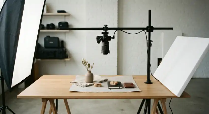
A tripod with an overhead arm. If you’re shooting flatlays (and you should be), this is non-negotiable. Handheld overhead shots are almost always slightly tilted, inconsistently framed, and blurry at the edges. A $40 tripod with a horizontal arm attachment from Amazon solves all of that.
One good light source. Natural light from a large window is the easiest and most forgiving option. North-facing windows give you soft, diffused light that doesn’t shift dramatically throughout the day. If you’re shooting in a space without good natural light, one large softbox positioned slightly above and to the side of your flat surface does the job. Not two. Not five. One.
A foam core board for bouncing light. Cost is about $3 at any craft store. Position it on the opposite side of your light source and it fills in shadows without making the image look flat. Every photographer uses this trick. Most don’t mention it.
Backdrops that match your brand. White foam board for clean, minimal aesthetics. Marble contact paper (also cheap) for a more premium feel. Linen or cotton fabric for warm, organic brands. Textured painted wood for rustic or outdoor-oriented boxes. You don’t need all of them. Pick two that work for your brand and stick with them.
Setting Up the Shot

Most subscription brands that do this well work with three types of images per box and shoot all of them in one session.
The hero reveals. Everything out of the box, arranged naturally around it. This takes the most time to style but it’s the image that does the most work commercially. More on styling below.
Individual or small group close-ups. Two or three products together, shot tight. These are for email campaigns, Story ads, and anywhere you need to highlight a specific item.
Leave more empty space around the products than feels right when you’re shooting. You’ll want that room when you’re cropping for different formats.
The human element shot. A hand interacting with the box. Someone lifting a product out, unfolding tissue paper, holding a card. This is consistently the highest-performing format on social for subscription brands because it breaks the visual pattern of static objects.
You don’t need a model. Just someone with clean, natural-looking hands and enough patience to hold a position for 30 seconds while you adjust the frame.
How to Style Without Overcomplicating It
Styling is where most brands either get it right or fall apart completely.
The instinct is to add more. More props, more products, more color. Almost always the right move is the opposite. Edit down until the photo looks almost too simple, then add one thing back.
A few things that work consistently across different box types:
Group products in odd numbers. Three items read more naturally than four. Five reads better than six. It sounds arbitrary until you start noticing it.
Create depth by overlapping. Let the corner of a product card slip under a jar. Let one item lean against another at a slight angle. Flat arrangements of products placed side by side look like inventory photos. Overlapping creates the sense that someone actually touched these things.
Use the tissue paper. Don’t smooth it flat or fold it neatly back into the box. Pull it out, scrunch it slightly, let it fall naturally. Crinkled tissue paper is one of the visual cues that triggers the unboxing feeling in the viewer. It’s a small thing that makes a big difference.
Match props to your brand story, not just to the products. A wellness box with essential oils doesn’t need crystals and a singing bowl. A single small plant or a folded linen hand towel in the background is enough context. Props exist to support the mood, not to tell their own story.
Camera Settings Worth Knowing
If you’re shooting on a mirrorless or DSLR, a few settings will save you time in editing.
Shoot in RAW, not JPEG. JPEG files compress the image and throw away data you’ll want back when you’re trying to recover highlights in white packaging or clean up a background. RAW files are bigger but they give you real flexibility.
For flatlays, use f/5.6 to f/8. A wider aperture like f/1.8 looks beautiful for portraits but when you’re shooting straight down, even a slight tilt in your surface means some products go soft. You want everything sharp.
Keep ISO at 100 or 200. More light is always the better solution to a dark shot. Bumping ISO introduces grain that shows up in backgrounds and on product surfaces in ways that are hard to clean up later.
Set a manual white balance or use a gray card. Auto white balance is inconsistent between frames, which turns batch editing into a much longer job.
Editing: Where Good Photos Become Great Ones
Most subscription brands edit in Lightroom or Photoshop, either desktop or mobile. The workflow doesn’t have to be complicated.
Start by culling before you edit anything. Go through your frames and pick your top 15 to 20 before you touch a single slider. Editing mediocre photos is a waste of time when you have better frames in the same batch.
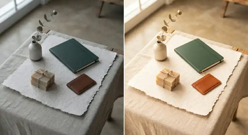
Fix exposure first, then white balance. For subscription box images, you almost always want clean, bright whites in the packaging without blowing out the highlights. Pull down the highlights slider a bit, push up the shadows slightly, and you’ll get more detail in both.
Add a small amount of texture or clarity. Not a lot. Around 10 to 15 on the clarity slider brings out detail in packaging, tissue paper, and product textures in a way that makes the image feel more tactile. Go too high and it starts to look like you ran it through a filter from 2012.
Color grading is where your brand identity comes in. Warm, amber-leaning tones work for food, wellness, and home goods. Cooler, cleaner tones work for beauty and skincare.
Whatever direction you choose, create a preset and use it on every image you publish. Consistency in color temperature is one of the simplest things you can do to make your feed look more professional.
Fix the small stuff. Dust specks on your backdrop. A slight wrinkle in the tissue paper that’s distracting. A stray hair. The healing brush takes 30 seconds per fix and makes a real difference.
Export at 2048 pixels on the long edge for most social and web uses. Keep sRGB as your color profile. Save your full-resolution edited masters separately so you have them when a publication asks for a high-res version six months from now.
Getting More Content Out of One Shoot
Subscription brands need a lot of images. One box, one shot, many formats.
Shoot your hero arrangement from three different angles: straight overhead, 45 degrees, and nearly at eye level. The same styling reads completely differently from each angle and gives you variety without restyling anything.
Leave room in the frame when shooting. An image with breathing room around the edges can be cropped into a square for Instagram, a vertical for Pinterest, a wide banner for your website, and a tight square for an ad unit. An image that’s cropped tight at the edges can only be used one way.
Batch edit by grouping similar shots together. Edit all your flatlays with the same hero preset, then all your close-ups, then your lifestyle shots. It’s faster than jumping between different image types and keeps the color more consistent within each category.
The Consistency Problem
This is the thing most brands don’t nail until a year or two in. Individual great photos are not a strategy. A feed that looks like it belongs to the same brand every single month is.
Build a one-page style guide for your shoots. Backdrop options, prop categories, color palette, light direction, editing preset name. Laminate it and put it on the wall in your shooting space if you have to. When you’re stressed on shoot day, that guide makes decisions for you.
Your February box and your August box should feel like siblings. Different products, same visual family. That’s what brand recognition looks like in photography.
One Last Thing
None of this requires a big budget or a professional studio. The brands doing this well aren’t outspending competitors. They’re just doing it consistently and thinking about it more intentionally than the average brand.
Start with the planning. Lock in your lighting setup. Build your editing preset. Shoot more frames than you need. The process gets faster every cycle, and the quality compounds over time in ways that show up clearly in engagement and conversion.
Your photos are often the first thing a potential subscriber sees. Make them feel something.