How to Write a Photo Editing Brief That Gets You Exactly What You Asked For
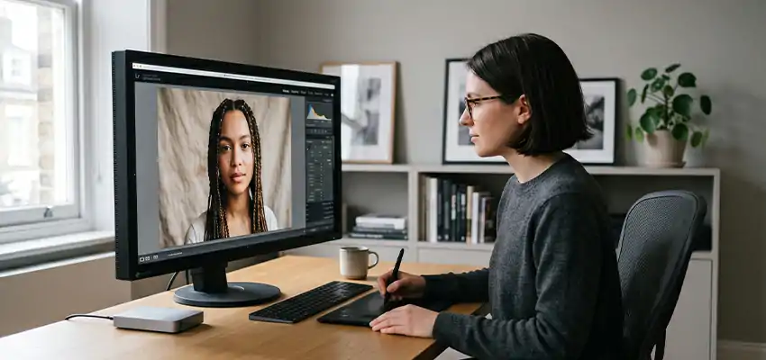
You send 300 photos to an editor. Three days later, they come back looking nothing like what you had in your head. The skin tones are too orange. The shadows are too dark. Everything feels slightly off. You ask for changes. Round two comes back. Still not right. By round three, you just accept it and move on.
This happens constantly. And almost every time, the brief is to blame.
Not the editor. Not their skills. The brief, or the complete absence of one.
Most people send a folder of raw files and write something like “please edit these, going for a clean natural look.” That sentence means something completely different to every editor who reads it.
One person’s “clean and natural” is another’s overprocessed and flat. Without real direction, editors do the only thing they can: use their own judgment. Sometimes that works out. Often it doesn’t.
Writing a solid brief takes maybe 20 minutes. Fixing bad edits on 300 photos takes days.
What a Photo Editing Brief Actually Is
It’s not a contract or a mood board. It’s a plain document that tells your editor what the photos are for, what you want them to look like, and what you absolutely do not want. That’s it.
Some people overthink this and write essays. Others skip it entirely. The goal is something in the middle: clear enough that an editor could do the whole job without asking a single question.
Start With Why the Photos Exist
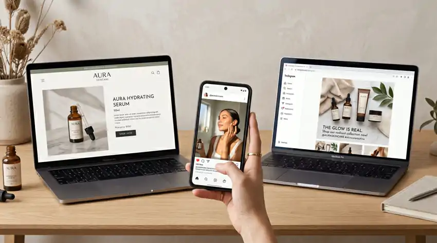
Before you say anything about color or contrast, tell your editor where these images are going and who’s going to see them.
An editor handling product photos for a high-end skincare website will make different choices than one working on a real estate listing or a kids birthday party album. Same editing skills, completely different approach. If you skip this context, they’re working blind.
Keep it short. Something like: “These are product shots for a wellness brand targeting women in their 30s. The images will live on the homepage, in email newsletters, and on Instagram. The brand is clean, soft, and minimal.”
That one paragraph changes how every single decision gets made.
Describe the Look You Want, Specifically
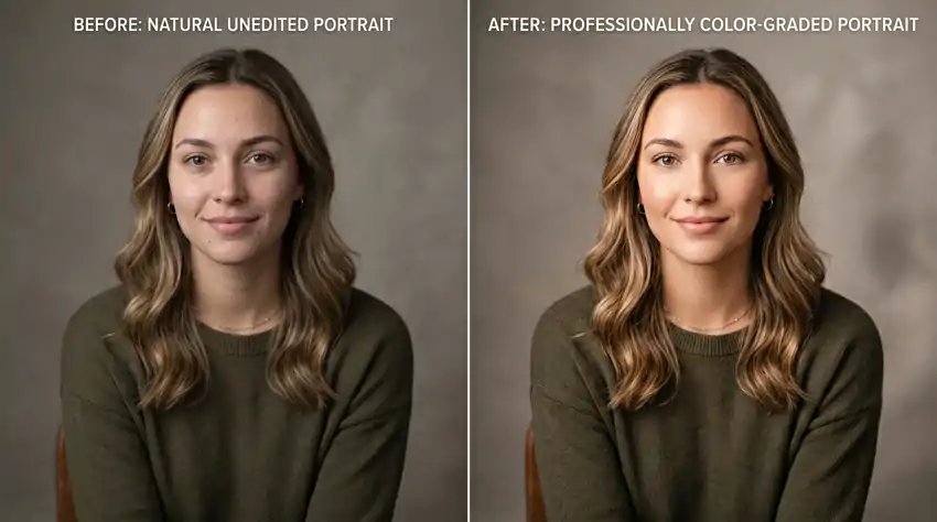
This is where most briefs fall apart. Words like “bright,” “moody,” or “natural” are close to useless on their own because everyone pictures something different.
Push past the adjectives. Think in actual visual terms.
Color temperature: Do you want the image to feel warm (golden, slightly amber) or cool (crisp, slightly blue)? Or neutral, as close to true daylight as possible? If there are whites in the frame, should they feel creamy or clean?
Contrast: High contrast images have deep shadows and bright highlights with not much in between. Low contrast images feel flatter and softer, more like film. Neither is better, they just create different feelings.
Saturation: Some people want color that pops. Others want it pulled back and muted. A heavily desaturated image with lifted blacks has a whole different feeling than a punchy, vivid one, even if the subject is identical.
Skin tones: This is the one that causes the most arguments. Do you want skin to look as true-to-life as possible? Warmer and more flattering? Poreless and airbrushed? Or do you actually want to see real texture and pores because that fits the brand? Get specific. “Natural skin tones, no heavy smoothing, but remove any temporary blemishes” is something an editor can actually work with.
Write these out in plain sentences. You don’t need photography vocabulary, just clarity.
Reference Photos Are Good. Annotated Reference Photos Are Great.
Most clients include reference images. That’s a good start. The problem is sending them with zero explanation.
When you drop in a reference and say “I want this look,” your editor has to guess what you actually mean. The lighting? The color grade? The skin treatment? The mood? All of the above?
Pick three to five reference images and write a sentence or two about each one. What specifically do you love about it?
For example:
“Reference 1: The skin tones here are what I’m going for. Warm but not orange, and you can still see real texture. The whites feel clean but not blown out.”
“Reference 2: I love the contrast here. Shadows are deep but there’s still detail in them. Nothing is crushed to pure black.”
“Reference 3: The overall feel of this one, not necessarily the color, more the softness. Nothing feels oversharpened.”
Now your editor knows what to take from each image. They’re not trying to copy the whole look, they’re pulling specific qualities you’ve already identified.
Tell Them What You Don’t Want
This might be the most useful thing in your whole brief, and almost nobody includes it.
Think about editing styles that aren’t right for this project. Think about what bothered you about edits you’ve received in the past. Write those things down.
Some examples of how this reads:
“No orange-teal color grading. I see it everywhere and it’s not the look we’re going for.”
“Please don’t over-smooth skin. The brand is about natural beauty and heavy retouching would contradict that.”
“Avoid crushing the shadows too much. I want richness but I also want detail in the darker areas.”
“No vignettes unless I ask for one specifically.”
“Don’t oversharpen. If anything, I’d rather it be slightly soft.”
This section protects you from the most common problems before they happen. It also tells your editor a lot about your taste without you having to explain your whole aesthetic philosophy.
Always Do a Test Batch First
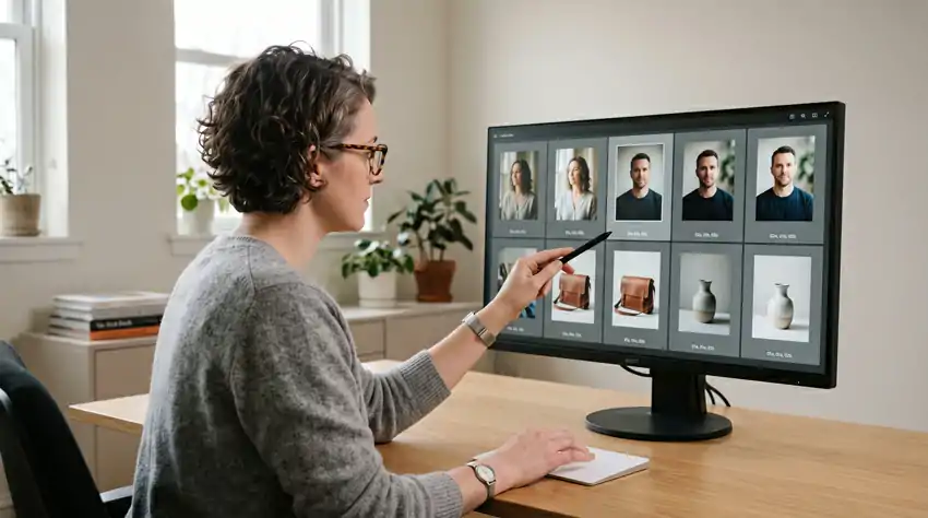
Before your editor touches the full batch, pull out eight to ten images that represent the variety in your shoot. Different lighting conditions, different subjects, different camera angles. Ask them to edit just those first.
When you get the test batch back, go through it carefully. If something’s off, you correct it in the brief and they adjust before doing the rest. This is miles easier than receiving 400 images with the same color grading problem and needing the whole thing redone.
It also tells you a lot about whether this is the right editor for this project. If the test batch is close to your vision with minimal notes, you’re in good shape. If it takes three rounds of corrections just to get the test batch right, you can have that conversation early rather than after they’ve processed everything.
The Technical Stuff Editors Actually Need
This is the part that feels boring but matters more than people realize.
File format and quality: Do you need JPEGs, TIFFs, or PNGs? If JPEGs, what compression level? High quality or maximum? This affects file size and sharpness.
Color profile: For anything going on screens, you want sRGB. For print work, Adobe RGB or ProPhoto gives you a wider range. If you don’t know, ask your printer or the platform you’re uploading to.
Resolution: Full resolution from the camera? Or a specific pixel dimension for a website or print size? Getting this wrong means the editor delivers unusable files and you have to ask them to redo the whole batch.
File naming: How do you want files labeled when they come back? Matching the original names? A new naming convention? This sounds minor until you’re hunting through 400 files trying to figure out which is which.
Delivery and deadline: Where should they send the files and by when? Dropbox, Google Drive, WeTransfer? And be realistic about the timeline. Professional retouchers are often booked out a week or more. “I need these tomorrow” is not a brief, it’s a problem.
Retouching Level: Be Blunt About This
If your shoot involves people, you need to say exactly how much retouching you want. This is not a place to be vague or polite.
Think of it in three basic levels:
Light: Clean up temporary blemishes like pimples or redness. Remove obvious fly-away hairs. Basic skin balancing. Keep all texture, pores, and natural features intact. The person should look like themselves on a good day.
Medium: Reduce under-eye circles, even out uneven skin tone, minimize distracting marks. Some softening is fine but the person should still look real. You’d look at it and think “good photo,” not “good retouching.”
Heavy: Full frequency separation skin work. Completely smooth and even complexion. You might go this route for certain fashion work or beauty brands where that’s the expected look.
For product photography, be equally specific. Do you want dust and fingerprints removed? Should background wrinkles or fabric creases be cleaned up? Are there surface imperfections that need fixing? Don’t assume editors know what “ready to publish” means for your specific product.
What to Do When You Work With Someone Regularly
If you send work to the same editor on an ongoing basis, your briefs can get shorter over time. This is actually one of the underrated benefits of working with the same person.
After a few projects, you build a shared shorthand. You can say “match the look from the March skincare shoot” and they know exactly what you mean. You’re not explaining from scratch every single time.
But even then, never skip the brief entirely. Projects change. Clients change. What worked for one shoot might be completely wrong for the next one. Keep sending a brief, even if it’s half a page. It protects both of you.
A Simple Template to Get You Started
Project context: What is this for, who’s the client, where will the images be used?
Look and feel: Color temperature, contrast level, saturation, mood in plain language.
Reference images (with notes): Three to five images with a sentence or two on what you like about each.
What to avoid: Three to five specific things you don’t want.
Retouching level: Light, medium, or heavy. Any specific instructions per image.
Technical specs: File format, color profile, resolution, naming convention, delivery method, deadline.
Priority images: Which images are most important and need the most attention?
Fill that in before every job. Your revision rounds will drop. Your editors will be happier to work with you. And you’ll actually get back what you asked for.
The photographers and creative directors who rarely deal with bad edits aren’t necessarily working with better editors. They’re just better at communicating what they want before the work starts. That’s a skill you can build in an afternoon. All it takes is slowing down for 20 minutes before you hit send on a folder of raws.