Cosmetics & Skincare Product Photography: How to Edit for Texture, Glow & Shelf Appeal
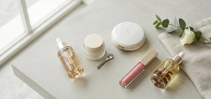
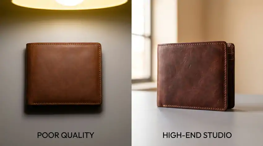
Pick up any beauty brand’s product page and you’ll notice something almost immediately. The good ones make you want to touch the product through the screen. The bad ones look like someone photographed a bottle under a bathroom light and called it done.
The difference isn’t always the camera or the lighting setup. A huge chunk of it is what happens after the shoot, in editing. And with skincare and cosmetics, that editing phase is genuinely hard to get right.
You’re working with materials that behave completely differently from each other. A glass serum bottle, a matte powder compact, a shiny lip gloss, a cream with visible texture, each one needs its own approach.
This isn’t a generic Lightroom tutorial. This is specifically about what works for beauty products, what trips people up, and how to edit these things so they actually look like the product a customer will receive.
Your Monitor Is Either Helping You or Lying to You
Start here before anything else.
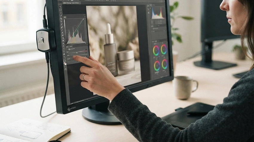
If your monitor isn’t calibrated, everything you do in editing is a guess. You might spend 20 minutes getting a red lipstick to look exactly right, then a customer orders it and gets something that reads completely different on their screen or in print.
Hardware calibration isn’t expensive relative to the problems it prevents. Tools like the Datacolor Spyder X or the X-Rite i1Display will run you $100 to $200 and they’ll make every color decision you make actually mean something. For e-commerce work, calibrate to sRGB. That’s the standard for screens and it’s what most platforms expect.
The other thing you need locked in before editing is RAW files. If you’re shooting JPEG for cosmetics work, you’re giving up a lot of latitude. A metallic cap that clips in camera can often be recovered from RAW. From JPEG, it’s gone. Dark glass packaging that holds shadow detail in RAW will just be a muddy mess in JPEG. Shoot RAW, every time.
White Balance Isn’t Just Technical. It’s a Brand Decision.
Here’s something that doesn’t get talked about enough. The “correct” white balance and the right white balance for a brand aren’t always the same thing.
A clean, technically accurate white balance might read as cold and sterile. That’s great for a medical-grade skincare line. It’s completely wrong for a brand built around warm botanicals and self-care rituals.
Pull the temperature slider toward 5500K to 6000K and things start to feel golden, natural, a little indulgent. Drop it to 4500K to 5000K and you get something more precise and clinical. Neither is wrong. It depends entirely on what the brand is communicating.
What matters most is that once you land on the right temperature for a brand or shoot, you stay there. Inconsistency across a product catalog is one of those things that undermines trust in a brand without customers being able to explain exactly why. They just feel like something’s off.
Editing Different Product Types (Because They’re All Different)
This is where most generic photography guides fall apart. They treat product photography like one thing. In cosmetics, the category is so wide that editing a serum and editing a pressed powder are almost completely different jobs.
Serums and liquid products
The goal with a serum is luminosity. You want it to look like it has depth and light inside it, not like water in a bottle.
Clarity is your friend here, but use it carefully. In Lightroom, a bump of around +10 to +15 gives the liquid some interior definition without making it look artificially sharpened. On the Curves panel, lifting the midtones slightly creates that inner glow effect. What you want to avoid is over-sharpening. Liquids that are sharpened too aggressively look stringy and cheap.
Creams and moisturizers
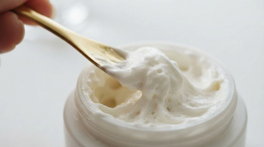
Surface texture is the whole point. When someone is looking at a moisturizer, they’re trying to understand the consistency. Is it thick? Silky? Whipped?
The Texture slider in Lightroom (different from Clarity, which affects midtone contrast) is specifically good for this. For cream swatches or open jar shots, somewhere around +20 to +35 on Texture starts to reveal the surface character without making it look gritty. You want it to look touchable, not rough.
Powder and pressed products
Powders are genuinely tricky. They flatten out easily and can look chalky or dimensionless in photos. The fix in editing is usually targeted dodging rather than global adjustments. In Photoshop, a soft Dodge tool at 5 to 8% opacity along the ridges and pressed patterns in a compact surface gradually reveals the dimension without blowing anything out. Work slowly. The difference between looking dimensional and looking overexposed on powder is about three passes of the Dodge brush.
Glossy lip products
High-gloss products live and die by their highlights. If the highlight on a lip gloss is harsh or in the wrong place, it reads as overexposed. If it’s controlled and deliberate, it reads as premium.
The fix is usually a Radial Filter placed over the highlight area. Pull the Highlights slider down to recover detail, then use a small positive Whites adjustment inside the filter to keep the specular point bright. This shapes the highlight rather than just blowing it out or killing it entirely.
Building Glow That Looks Real
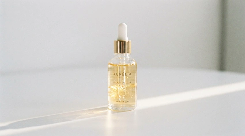
Glow is one of those editing effects that looks great when it comes from actual light in the image and looks terrible when it’s manufactured from nothing.
The editing move that works consistently is this: lift your Whites slightly (around +15 to +25) while pulling Highlights down (-15 to -30). What this does is expand the brightest areas of the image while preventing them from clipping. The result is luminosity with detail still intact, which is what glow actually looks like versus what overexposure looks like.
For metallic packaging, glass droppers, and foil labels, the technique is a little different. These surfaces get their premium look from the contrast between their bright specular points and the shadows immediately next to them.
Using the Burn tool in Photoshop at very low opacity (3 to 5%) in the shadow areas adjacent to highlights increases that contrast locally. It makes the surface read as more three-dimensional and catches-light without touching the highlights at all.
Luminosity masks in Photoshop are the more advanced version of this. By selecting only the brightest tonal ranges and applying a gentle Curves adjustment there, the glow follows the actual light in the image. It’s far more convincing than applying a glow effect over the whole image.
Color Accuracy Is Non-Negotiable
This one isn’t about aesthetics. It’s about returns and customer trust.
A customer orders a blush in “Dusty Rose.” It arrives looking like coral. That’s a product return, a negative review, and a customer who probably won’t come back. Color accuracy in cosmetics isn’t a nice-to-have.
The standard workflow is to shoot a ColorChecker card in your first test frame. Products like the X-Rite ColorChecker Passport generate a custom camera profile that corrects for lighting color shifts before you do anything else. In Lightroom or Capture One, applying that profile is the first step before any other edit.
Red tones specifically tend to go wrong. Camera sensors often push reds slightly orange or slightly magenta depending on the light source. A 3 to 8 degree Hue adjustment in the HSL panel is usually enough to bring a red back to where it belongs. But test it against the physical product in your hand. The product is always the reference point, not your memory of what red should look like.
For foundations and concealers, use a real hand swatch in the frame. If the swatch looks accurate on your calibrated monitor, the product color is right. There’s no substitute for a physical color reference when accuracy actually matters.
What to Do With Backgrounds and Shadows
The background is working even when you’re not thinking about it.
On white, shadows communicate weight and dimension. They’re what makes a product look like it’s sitting on a surface rather than floating in digital space.
For pure white background work (Amazon, most e-commerce marketplaces), your background needs to hit 255,255,255 but you also need to think carefully about shadows before removing them entirely. A well-placed soft shadow is often what keeps the product from looking weightless and fake.
The cleanest approach for e-commerce white backgrounds is to use the Pen tool to select the product and background separately, bring the background to pure white, and then paint a soft, controlled shadow back in using a low-opacity brush on a separate layer. This gives you full control over where the shadow falls and how diffused it looks.
For campaign and lifestyle shots, leave your shadows alone. Natural shadows are what makes a product feel like it exists in the real world. A face oil sitting on a marble surface with a soft natural shadow under it looks like a real product in a real place. Remove the shadow and it starts to look like a composited image.
Retouching Packaging: Know Where to Stop
Every physical product has imperfections. Fingerprints. Dust. A tiny label that’s slightly off-center. A small scuff on the packaging. These need to be cleaned up in post. Clone Stamp, Healing Brush, Content-Aware Fill, use whatever works.
But there’s a real risk of going too far. When packaging gets retouched until every surface is perfectly uniform, every reflection is symmetrical, and every shadow is mathematically precise, it starts to look like a 3D render. And customers notice, even if they can’t articulate exactly what’s wrong. The product loses credibility.
Clean up the things that are clearly defects. Leave the subtle surface variation that makes it look like a real object.
Export Settings by Platform
Get these wrong and your editing work gets undone by compression.
Amazon: JPEG, sRGB, minimum 1000px on the long side (2000px gives customers the zoom feature, which is worth it).
Instagram: 1080px square or 1080 x 1350px portrait, sRGB, save at quality 85 to 90% in Photoshop.
Your own website: WebP is worth converting to. Smaller file size, comparable quality to JPEG, better page load speed.
Print materials: Hand off a TIFF at 300 DPI in CMYK. Don’t give your designer a compressed JPEG and expect clean print output.
A Quick Pre-Delivery Check
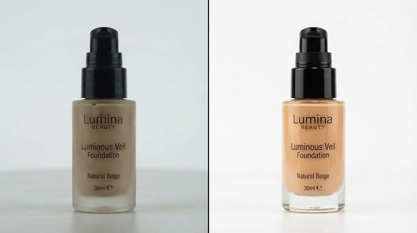
Before you hand over or publish any cosmetics shoot, check these:
- White balance is consistent across every image in the set
- Product color matches the physical product on a calibrated monitor
- Texture is visible without being over-sharpened
- Highlights are controlled and no packaging detail is blown out
- Background is consistent and clean
- Shadows are intentional, not accidental
- All dust, fingerprints, and packaging defects are gone
- File format and dimensions match the platform requirements
When the editing is done right, nobody notices the editing. They just see a product that looks worth buying, accurate to what they’ll receive, and good enough to stop the scroll. That’s the whole job.
Getting there takes practice with these specific materials and lighting behaviors. But the photographers and retouchers who figure it out for beauty products tend to build long client relationships, because not everyone does this well.