Art of Product Photography Composition: Tips for Product Photographers

Composition, in plain terms, is just how you arrange stuff inside a frame. Where the product sits, how much empty space is around it, which angle you’re shooting from – all of that adds up to composition. Good composition does one job really well: it tells the viewer’s eye where to look first, then second, then third. There’s no magic in it, honestly. Just a handful of tricks photographers have leaned on for decades because, well, they work.
If you’re new to this, learning a few of these rules early on will save you a lot of guesswork later. And look, we’ll say this upfront – some of the best product photos out there break every single rule on this list. But you can’t really break a rule on purpose until you understand why it exists. So let’s start there.
Here’s a rundown of the composition techniques that are still worth knowing in 2026.
Suggested Article– Top Product Photography Courses.
1. Rule of Thirds
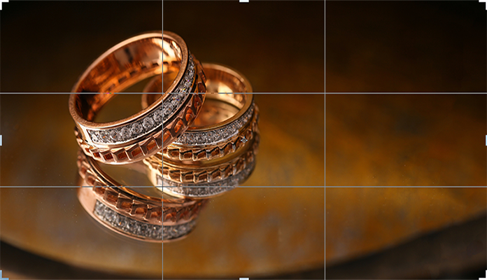
Photo by The glorious studio
When you’re just starting out, there’s a strong pull to plant the product right in the middle of the frame. Try to resist that. The Rule of Thirds works by splitting your frame into nine equal boxes using two horizontal lines and two vertical ones. Most phones and cameras let you switch this grid on in the viewfinder, so turn it on if you haven’t already.
Instead of centering things, place your product along one of those lines – or even better, right where two of them cross. People’s eyes land on those intersection points faster than they land on dead center, which is honestly a bit strange when you think about it, but it’s been tested and it holds up.
Let the rest of the frame sit empty. It makes the whole shot feel more balanced without you doing much extra work.
2. Golden Triangle Rule

Photo by Binoid CBD
The Golden Triangle Rule is another important compositional method that is almost similar to the Rule of Thirds. In this rule, the photo is divided into triangular sections and there must be a strong diagonal element to apply this rule in a photo. The grid contains a diagonal line connecting two corners of the frame, and there will be two additional lines from the other two corners intersecting the diagonal at right angles forming two right-angled triangles.
This photographic composition might seem to be a bit more complex for a beginner than the Rule of Thirds. But once you get used to it, you will benefit from applying it to every single photo you take.
3. The Rule of Odds

Here’s a weird one that actually makes sense once you notice it: three items in a photo just feels more natural than four. That’s the Rule of Odds. When you’re photographing a group of products, stick to odd numbers, three or five usually does the trick. Even numbers are easy for our brains to process and move past quickly. Odd numbers make us pause a beat longer.
Don’t just line the items up in a neat row either. Change the height, the angle, maybe the size or color of each one, and put them on slightly different planes if you can. That little bit of variation is what stops the shot from looking like a boring lineup.
4. Leave Some Negative Space

Photo by Artem Podrez
Negative space is the part of your photo with nothing in it – the plain wall, the empty table surface, whatever isn’t the product. Sounds counterintuitive to leave space unused when your whole job is selling a product, right? But that breathing room is exactly what makes the item stand out more. It’s also useful practically, since designers often need somewhere to drop in text for ads or social posts.
The hard part is picking colors and fonts that actually feel like they belong in that empty space rather than looking pasted on top. Go look at a few billboard ads next time you’re driving somewhere. You’ll start noticing how carefully that empty space gets used.
5. Apply differential focus to make the subjects pop out

Photo by Grailify
Sometimes called selective focus, this is about deciding what stays sharp and what fades into blur. In product shots, that usually means a crisp, in-focus product up front with a soft, blurred background behind it. It’s a small technique but it does a lot of heavy lifting – your eye just naturally goes to whatever’s sharpest in the frame, so let that be the product.
You may also read- Diamond Photography Tips.
6. Dynamic Diagonals

Photo by Pegah
Diagonal lines bring a kind of energy to a photo that straight horizontal or vertical lines just don’t have. The idea here is to line your product, or whatever the main focal point is, up along an imaginary diagonal running through the shot. Everything else in the frame should feel like it’s supporting that line, not competing with it.
This one’s pretty easy to pick up once you try it a few times, and it can turn a flat, kind of boring product shot into something that feels like it has movement.
7. Shoot from angles that best highlight the most important features

Photo by Ferdinando Ferrazzi
Not every product looks its best straight on or from directly above. Some do. A lot don’t. It’s worth experimenting with a few different angles before you settle on one.
A 45-degree angle looking down, for example, makes it seem like the product is sitting on a shelf or table right in front of the viewer, which tends to feel more real and less staged than a flat top-down shot.
Changing the angle even slightly can add real depth to a photo that would otherwise look pretty flat. So don’t just take the first shot and call it done – move around, try a few heights, see what actually works.
8. Use design elements such as line, color, shape, texture, etc.

Photo by Elsa Olofsson
These basic design elements get overlooked a lot, but they matter more than people think. A line – whether it comes from a wood plank, a fence rail, the edge of a table, anything – can pull the eye across the frame without the viewer even noticing it’s happening.
Color sets a mood, and if you’re consistent with it across your product shots, it starts to feel like a brand rather than a random photo. Shape and texture add character, and honestly, they can trigger an emotional reaction that a flat, plain shot never will.
Don’t be afraid to mess around here. Swap out a background texture, shift a color slightly, and you’d be surprised how different the whole product suddenly feels.
9. Shoot from the front angle and center the product

Photo by Anissa Mebarkia Thomsen
Sometimes the simple approach wins. Put the product dead center, shoot it straight on, and you remove basically every distraction from the frame. There’s a reason this classic setup has stuck around for so long – it just works.
You can shoot it up close in the foreground, or pull back a bit and blur the background with a shallow depth of field. Either way, there’s nowhere else for the eye to wander. It’s all product, all the time.
10. Shoot from a top-down perspective

Photo by Alex Azabache
We’re all used to seeing products shot from the front or at an angle, so a top-down shot tends to stand out just because it’s different. This angle, usually called a flat lay, works particularly well when you’ve got multiple items or props you want arranged around the main product to tell a bit of a story.
It shows up a lot in food photography for exactly that reason – all that empty space around the food gets filled in with ingredients, utensils, napkins, whatever fits the scene. If you want the product to still pop, try blurring the background a touch even in a flat lay.
You may also like: Best Watch Photography Tips.
To Conclude
These ten techniques show up again and again in product photography, and if you’re still finding your footing, they’re a solid place to start. But don’t treat them as rules you can never break. Once you actually understand why they work, you’ll start to notice the moments where breaking one is exactly the right call.
At the end of the day, it comes down to one thing: keep the viewer’s eye on the product long enough that they actually want it.