sRGB vs Adobe RGB for Product Photography: Which Color Profile Should You Use?
Here is a scenario a lot of product photographers know well. You spend hours nailing the lighting, getting clean white backgrounds, making a client’s products look genuinely good.
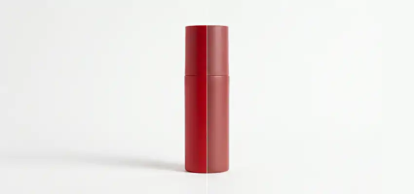
You export the files, send them over, and then get a message: the colors look off. The reds are too muted. The packaging looks nothing like the actual product.
Nine times out of ten, that is a color profile problem.
sRGB and Adobe RGB are the two color profiles you will deal with most in product photography. Picking the wrong one at the wrong stage does not just cause minor tweaks. It can mean flat, desaturated images on a client’s store, or wasted color data when files go to print.
This article covers what each profile actually does, when to use each one, and the specific workflow decisions that prevent color problems from happening in the first place.
What Are Color Profiles and Why They Matter
A color profile is a set of rules that tells your camera, monitor, printer, or website how to read and show color. Without one, the same file can look completely different on two different screens. What registers as a rich teal on your monitor might render as something closer to a flat grey-green on the client’s laptop.
Every device in the chain, your camera, your editing software, your monitor, and the platform your images end up on, needs to agree on what a given color value actually means. Color profiles are how that agreement happens.
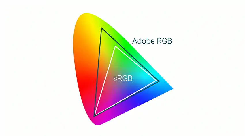
sRGB and Adobe RGB both define a color gamut, which is just the range of colors a profile can represent. sRGB covers a narrower slice of visible color. Adobe RGB covers a wider one, with more range especially in greens and cyans.
That difference matters, but only in specific situations. The mistake most photographers make is assuming bigger gamut automatically means better results. It does not. The right profile is the one that matches where the image is going.
That sounds simple enough. But choosing the wrong one at the wrong stage of your workflow can cost you hours of re-editing and unhappy clients.
sRGB Explained: The Web Standard That Rules Everything
HP and Microsoft developed sRGB in 1996 for use with computer monitors and the web. It is now the default color space for screens, browsers, phones, and every major e-commerce platform on the internet. When you open an image in Chrome, Safari, or any standard browser, it assumes the file is in sRGB.
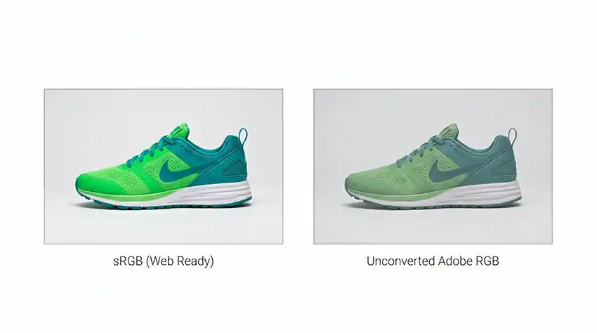
Amazon, Shopify, Etsy, Instagram, and virtually every other platform where product photos appear are built around sRGB. Upload an Adobe RGB file to any of these without converting first, and the platform will usually strip or ignore the embedded profile. The result is colors that look flat compared to what you saw on your screen while editing.
This trips people up because it looks like a Lightroom or Photoshop problem. It is usually a color profile problem.
One thing worth saying directly: sRGB is not the “lesser” option. It is the right tool for digital output, which is where most product photography ends up. Choosing sRGB is not settling for less. It is matching the standard that everything online is built around.
Use sRGB when:
- Your images are going directly to e-commerce platforms like Amazon, Etsy, or Shopify
- The client will use the photos on their website, social media, or digital ads
- You are shooting for a brand that handles most of its visual presence online
- You want to minimize color correction problems during delivery
- Your monitor is not wide-gamut calibrated
Adobe RGB Explained: The Wider Gamut for Print Work
Adobe created this profile in 1998 specifically to address a gap sRGB left behind: print. High-end inkjet printers, commercial offset presses, and print production houses can reproduce colors that fall outside what sRGB can describe. Adobe RGB captures about 50 percent more of the visible spectrum than sRGB, with the biggest difference showing up in greens and cyans.
For a product catalog going to commercial print, that extra color data can make a real difference. A fabric swatch, a paint color, a food product shot with vivid greens.
These all benefit from the wider range Adobe RGB can hold. If you deliver sRGB files to a commercial printer, some of that richness is gone before the press even touches the paper.
Here is the part people often skip: to actually see those extra colors while editing, your monitor has to be a wide-gamut display, properly calibrated. If you shoot Adobe RGB but view the files on a standard sRGB monitor, you will not see any difference in Lightroom. You are just carrying extra data you cannot see, which creates risk if something in the export chain strips the profile.
Use Adobe RGB when:
- The client needs high-resolution print materials, like product catalogs, packaging mockups, or billboard ads
- You are delivering files to a prepress team or print studio that specifically requests Adobe RGB
- Your entire workflow uses wide-gamut monitors and calibrated equipment
- You want to preserve maximum color data for professional retouchers
- The images will go through significant post-processing before final output
sRGB vs Adobe RGB: Head-to-Head Comparison
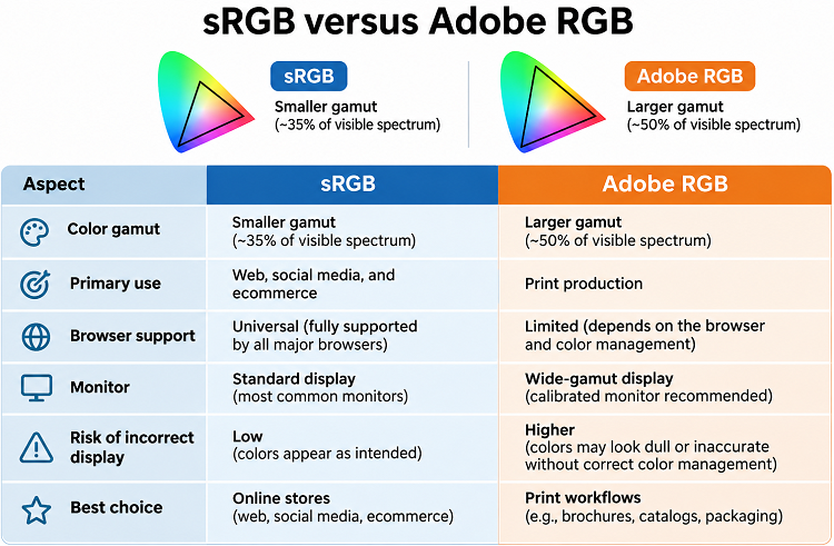
A quick side-by-side of the key differences:
Which Should You Use for Product Photography?
For the majority of product photographers, the answer is sRGB, and it is not a close call.

Think about where product photos actually live. Amazon listings. Shopify stores. Brand websites. Instagram and Pinterest feeds. Google Shopping. Every one of these platforms serves images in sRGB to devices calibrated for sRGB.
Delivering Adobe RGB files to these destinations adds zero visual benefit and creates real risk. If a platform strips the embedded profile, your carefully edited colors shift in ways that are hard to predict and annoying to fix.
For a web-only workflow, the whole pipeline is simple: shoot in sRGB, edit in sRGB, export in sRGB. No conversion step. No risk of something going wrong in the handoff.
Adobe RGB becomes the right choice specifically in print-heavy work. Product catalogs, packaging mockups, retail brochures, billboards. Anywhere a commercial printer or prepress team is in the chain. Even then, you will likely need to deliver a separate sRGB version for any digital use of the same images. Building that into your export workflow from the start is worth doing.
The smartest thing you can do before a shoot is ask a simple question: where are these images actually going? Web only, go sRGB. Print production or catalogs, ask the prepress team what they want. Mixed use, plan to deliver both versions.
Two minutes of that conversation before the shoot can save hours of re-editing after.
Real-World Workflow Tips
Set the right profile in-camera before you shoot.
On most DSLRs and mirrorless cameras, you will find this under Picture Style or Picture Control. If you are shooting JPEG, the color space gets baked into the file at capture and cannot be changed after the fact.
If you shoot RAW, the camera setting does not lock in the color data the same way, but you still need to assign a working color space in Lightroom or Camera Raw when you process the files.
Lock your working color space in Lightroom or Photoshop.
In Lightroom, go to Edit, then Preferences, then External Editing, and set the color space to sRGB for a web workflow. In Photoshop, go to Edit, then Color Settings, and choose sRGB IEC61966-2.1 as your working RGB space.
If you are doing print work, ProPhoto RGB is often used as an editing space because of its very wide gamut, but always convert to the right output profile before you send files anywhere.
Embed the color profile every time you export.
This tells every device or platform down the line how to read the colors in your file. A file without an embedded profile is guesswork for anything that receives it.
Soft proof before you send print files.
In Photoshop, View, then Proof Colors with the target print profile loaded will simulate how your image looks in print before it goes anywhere. You will catch out-of-gamut colors early instead of hearing about them from a client after the press run.
Get your monitor calibrated.
Everything above rests on this. An uncalibrated monitor means color decisions based on information that is wrong. Tools like the X-Rite i1Display or the Datacolor Spyder cost less than a single day of re-editing jobs because of avoidable color problems.
Common Mistakes Photographers Make with Color Profiles
Pushing Adobe RGB files straight to web platforms.
This is the most common one. When a platform receives an Adobe RGB file and does not handle the embedded profile properly, it displays the file as though it were sRGB. Colors that looked vibrant in Lightroom show up flat and muted on the store. Clients notice. It is one of those problems that looks like bad editing but is actually a file format issue.
Thinking RAW files are immune.
RAW files do not have a baked-in profile the way JPEGs do, but your editing software assigns a working color space the moment it opens the file. Ignoring those settings in Lightroom or Camera Raw can still create color shifts on delivery.
Editing Adobe RGB on a standard sRGB monitor.
If your monitor cannot display the extra colors Adobe RGB holds, you are making editing decisions based on a compressed view of the file. The adjustments may not translate correctly when the image goes to a wide-gamut output device.
Converting too late, then sending the wrong version.
Some photographers edit in Adobe RGB and convert to sRGB at export. That works, but it creates a moment where the wrong file can go out if the export preset is wrong or gets changed. Automating the conversion inside a fixed export preset removes that risk entirely.
Not asking what the client actually needs.
Probably the most fixable mistake on this list. A quick question before the shoot about whether deliverables are for digital, print, or both takes two minutes and prevents most color profile problems from ever happening.
Frequently Asked Questions
Does shooting in sRGB reduce image quality?
No. For digital output, sRGB is the right choice and does not represent a quality loss. It is a different color range, one calibrated to match what screens display.
Can I convert Adobe RGB files to sRGB after editing?
Yes. In Lightroom, set the color space in your export settings and it handles the conversion automatically. In Photoshop, go to Edit, then Convert to Profile, and choose sRGB.
What color space does Amazon require?
Amazon recommends sRGB for all product images. Shopify, Etsy, eBay, and Walmart Marketplace do too. If you submit Adobe RGB files, results depend on how each platform handles the embedded profile, and that is inconsistent across platforms.
Is ProPhoto RGB better than Adobe RGB for product photography?
ProPhoto RGB covers nearly the entire visible spectrum and is used as an internal editing space in some workflows to avoid clipping colors during heavy processing. It is not an output format for web or standard print.
What if my camera does not have an Adobe RGB option?
Most cameras do. But if yours does not, or if you shoot RAW, the in-camera setting does not lock the color profile into the raw data the way it does with JPEG.
How do I check what color profile an image is using?
In Photoshop, go to Edit, then Assign Profile to see what is embedded. In Lightroom, the working space shows in Preferences. On a Mac, open the image in Preview, go to Tools, then Show Inspector, and look at the Color Profile field.
The Bottom Line
Color profile decisions are not complicated once you stop treating them as a technical mystery and start treating them as a workflow question: where is this image going?
If the answer is a website, an online store, or anything viewed on a screen, use sRGB. It is what every platform expects, what every screen is calibrated to show, and what gives you the most consistent results across the most devices.
If the answer is commercial print, ask the prepress team and follow their spec. Adobe RGB is the right choice when the whole chain can use it, and a wasted choice when it cannot.
Photographers who consistently deliver clean, accurate color are not necessarily more technical than others. They ask better questions up front, build tighter export presets, and calibrate their monitors. That is a process, not a talent.
Match the profile to the destination. Embed it on export. Check your monitor is calibrated. Those three things will solve most of the color problems photographers blame on their cameras, their editing, or their clients.
Get this right once and you will not have to think about it again.